KOD DESIGN BI 디자인
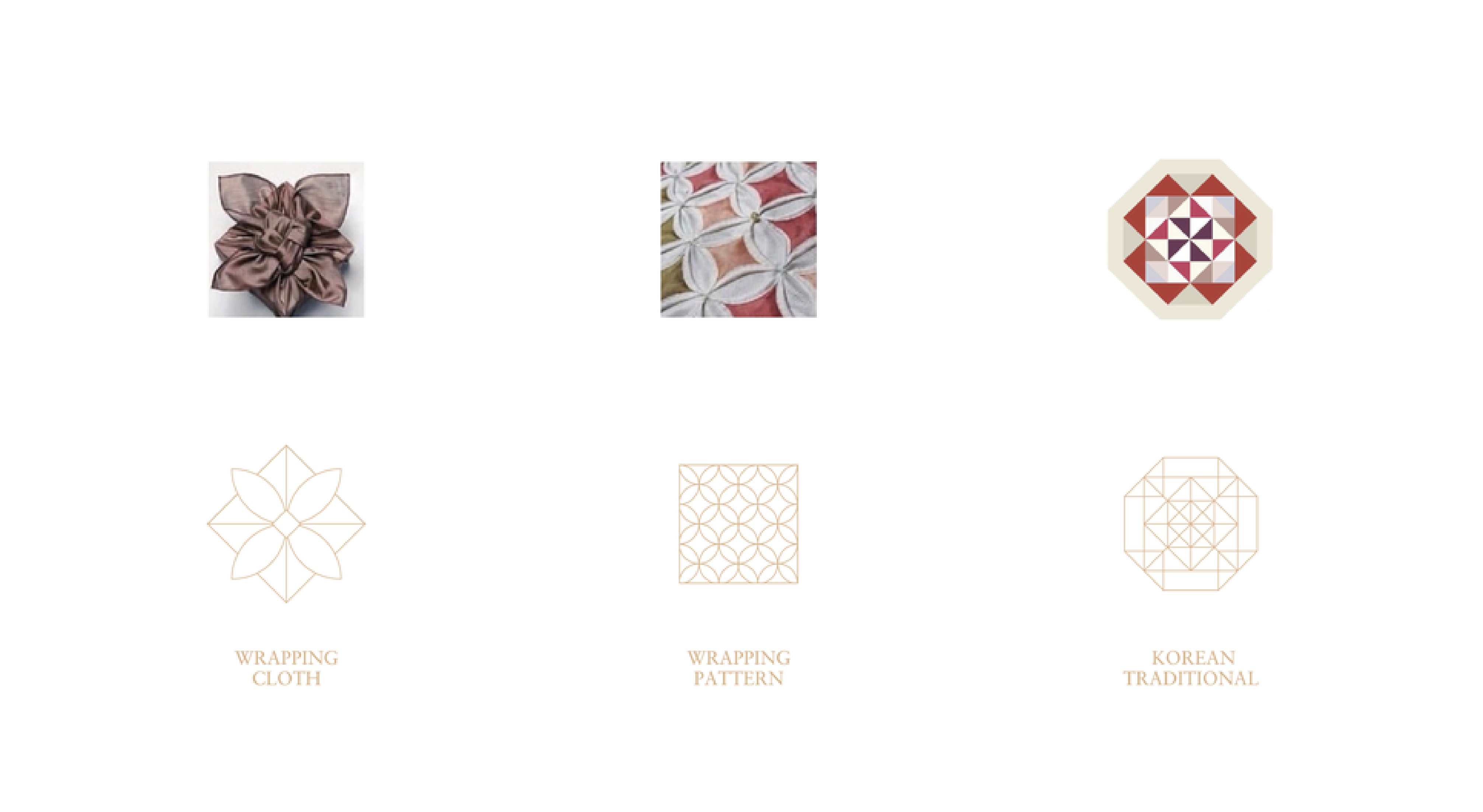
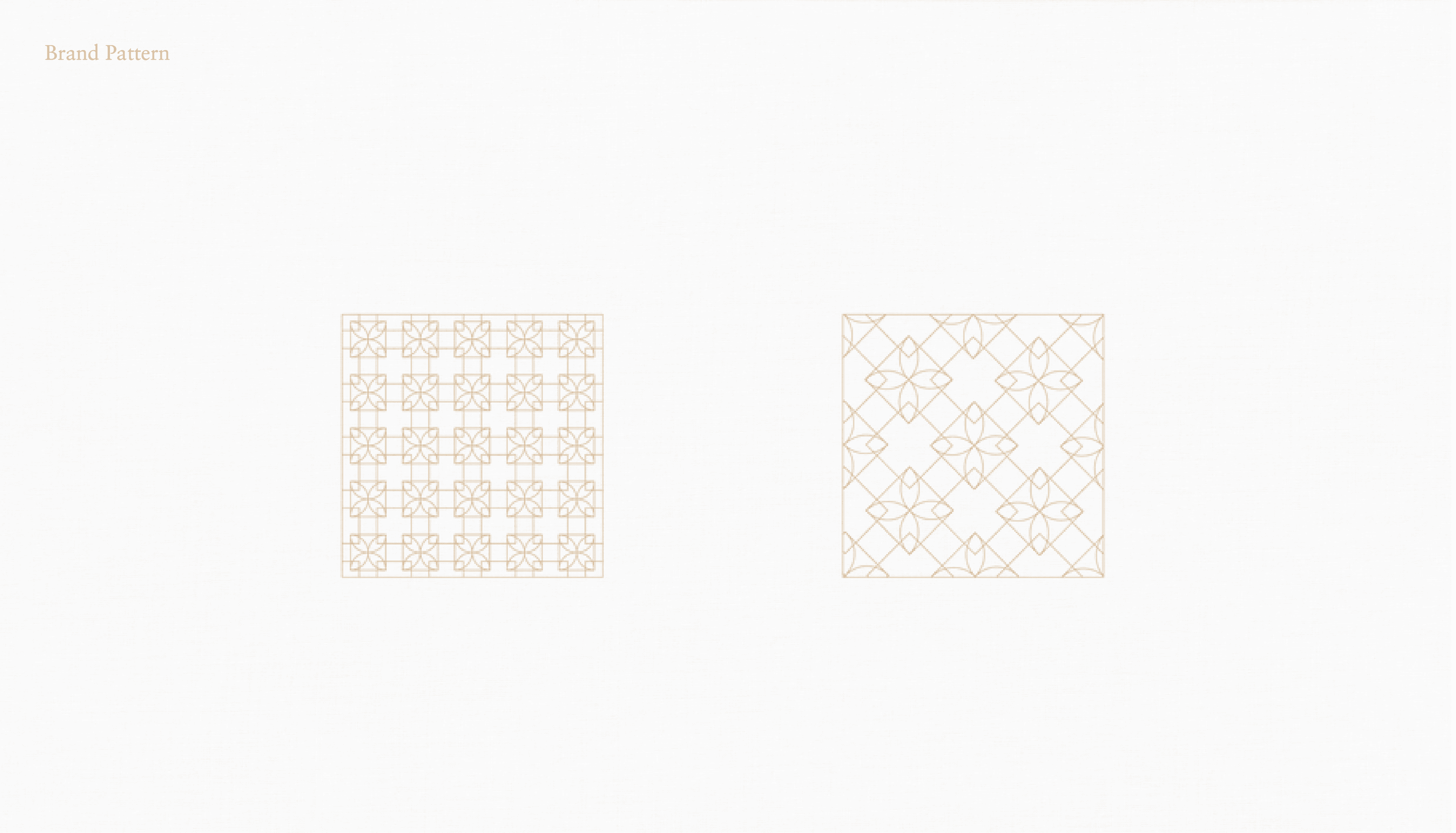
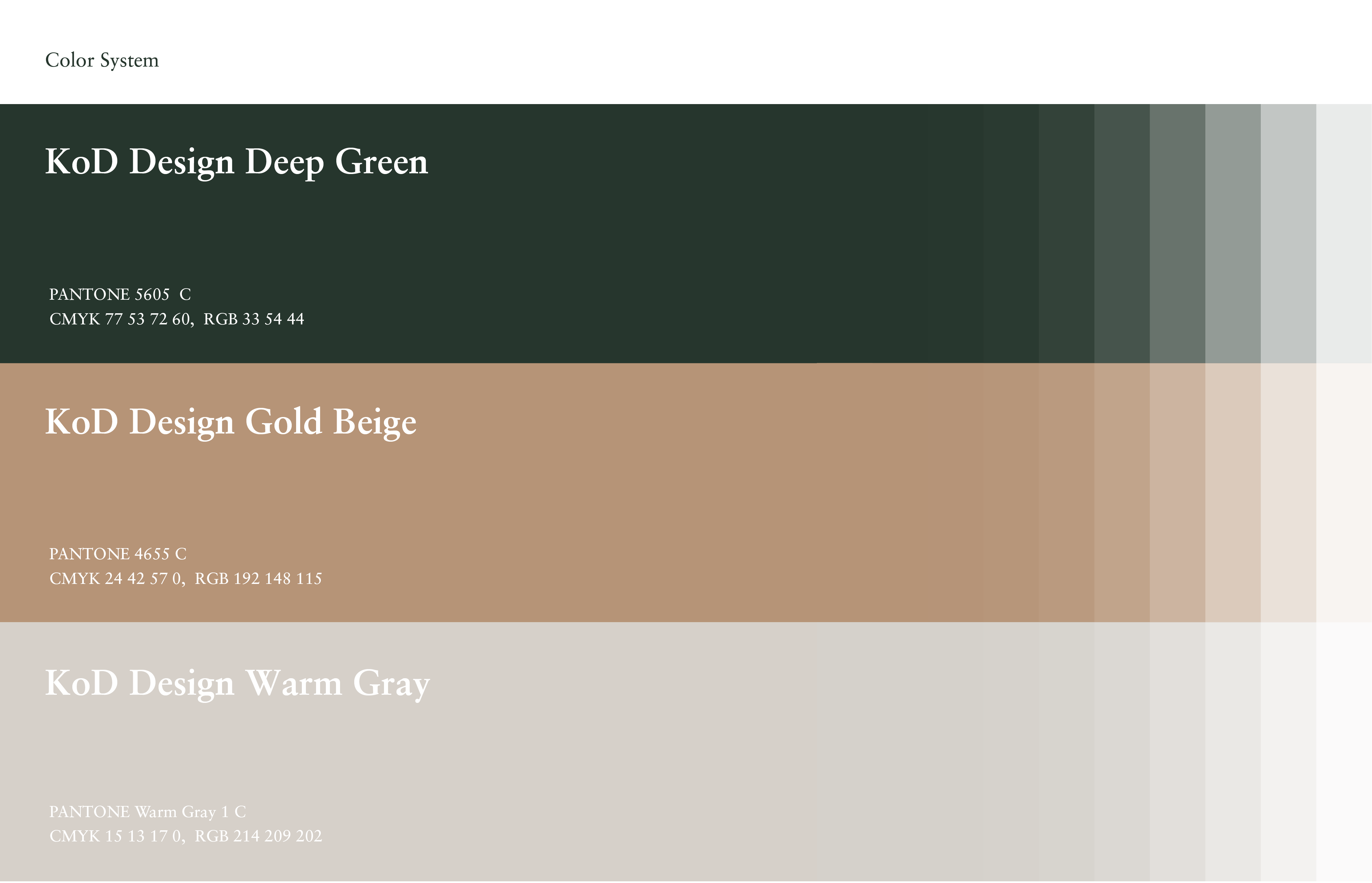
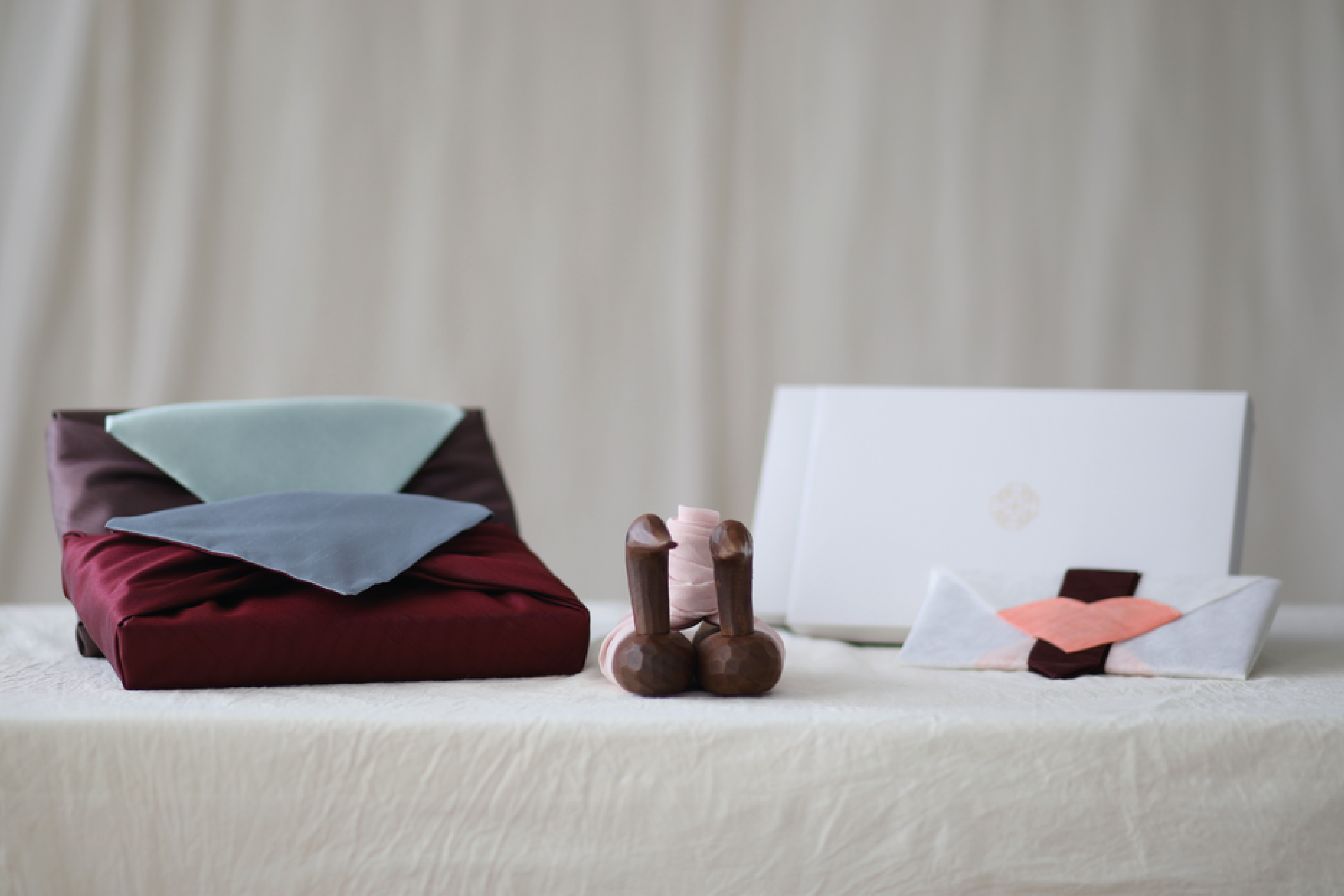
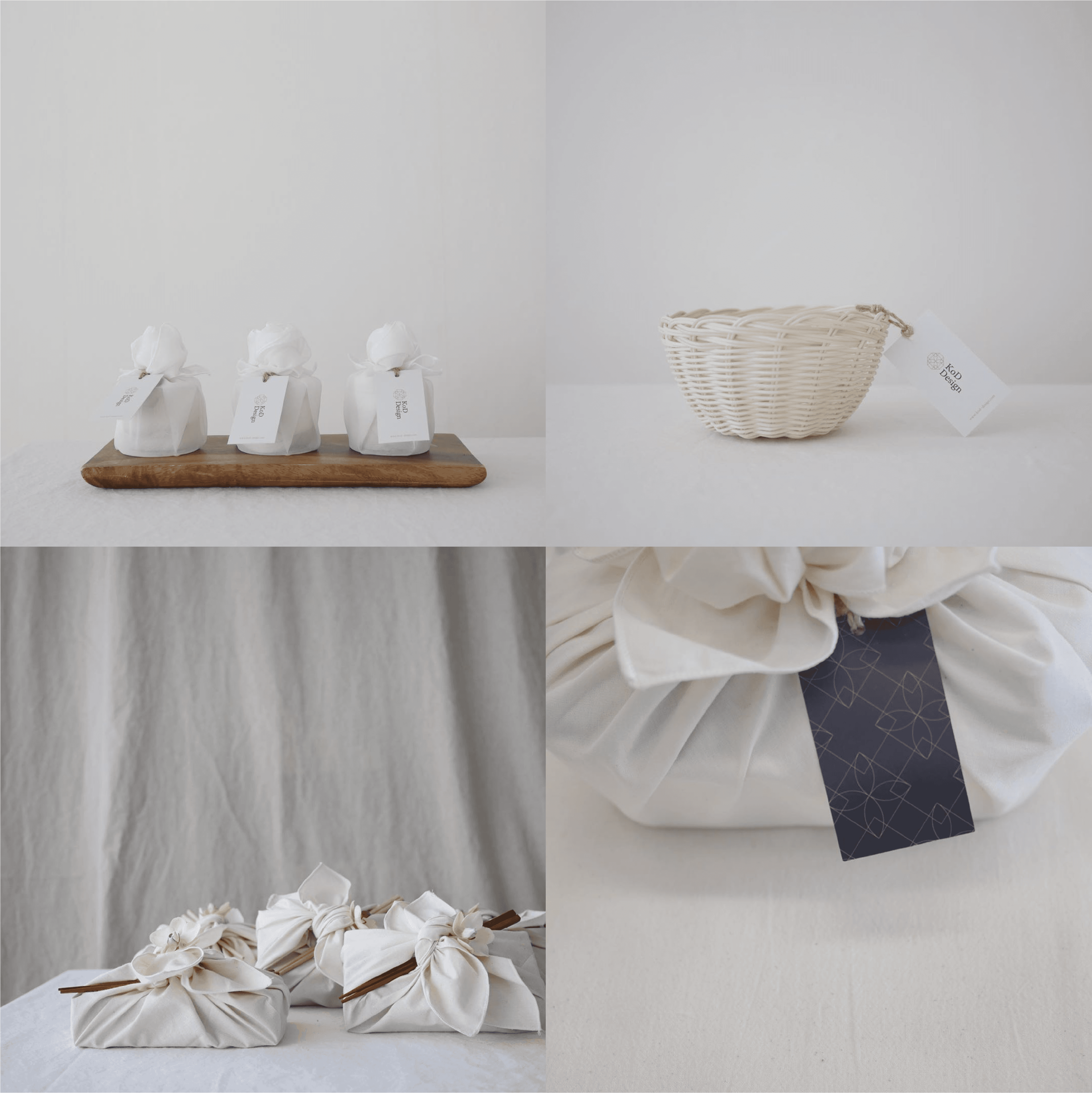
코드디자인은 전통 규방공예와 보자기 포장을 현대적으로 재해석하는 브랜드입니다. 심벌은 보자기의 매듭 형태와 전통 문양인 여의주문보의 패턴에서 모티브를 얻어 디자인하였으며, 한국적인 아름다움과 전통의 가치를 현대적인 감각으로 표현했습니다. 브랜드 컬러는 짙은 녹색과 골드 베이지를 사용하여 전통이 지닌 품격과 고급스러운 이미지를 담아냈으며, 이를 통해 코드디자인만의 차분하고 우아한 브랜드 아이덴티티를 구축했습니다.
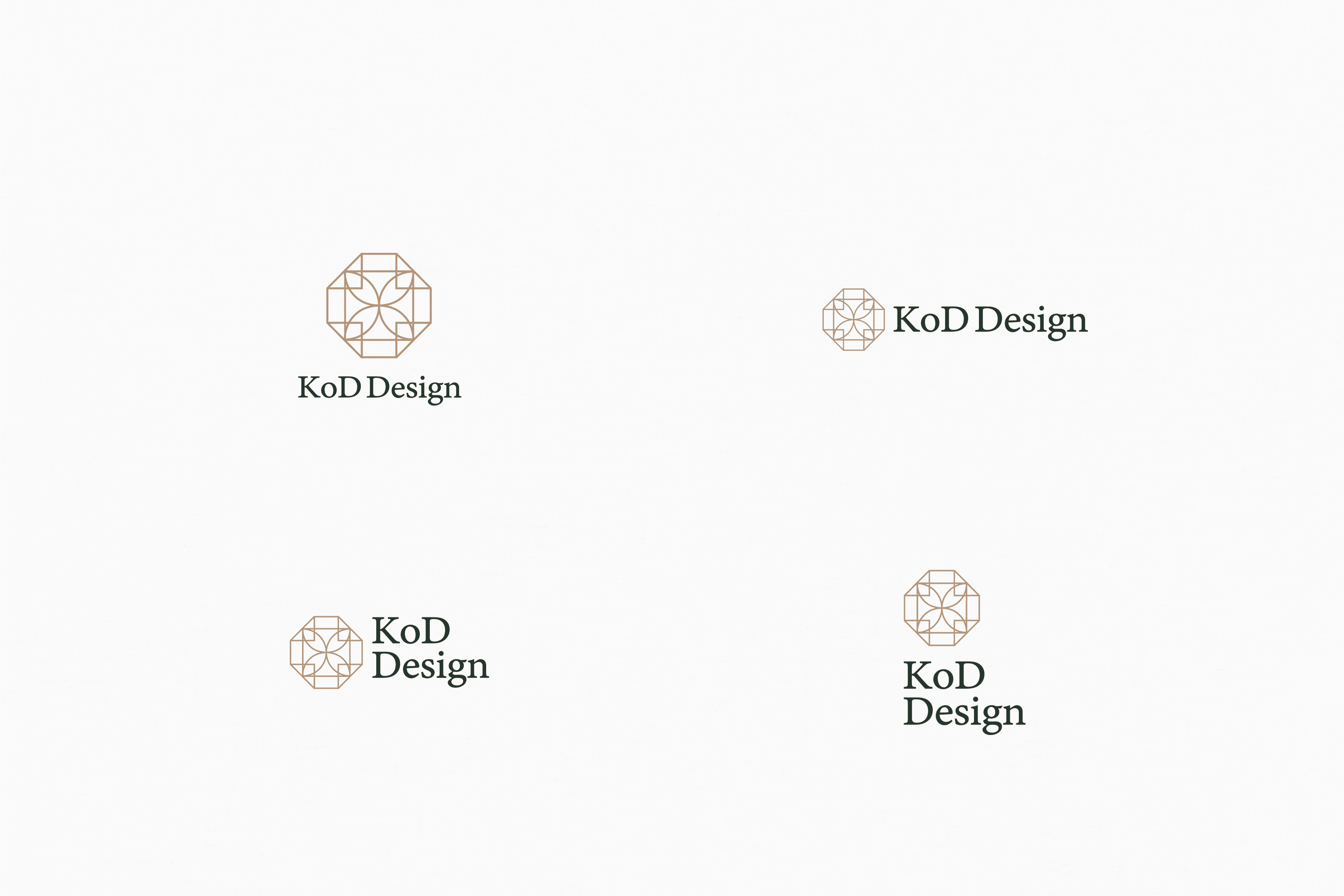
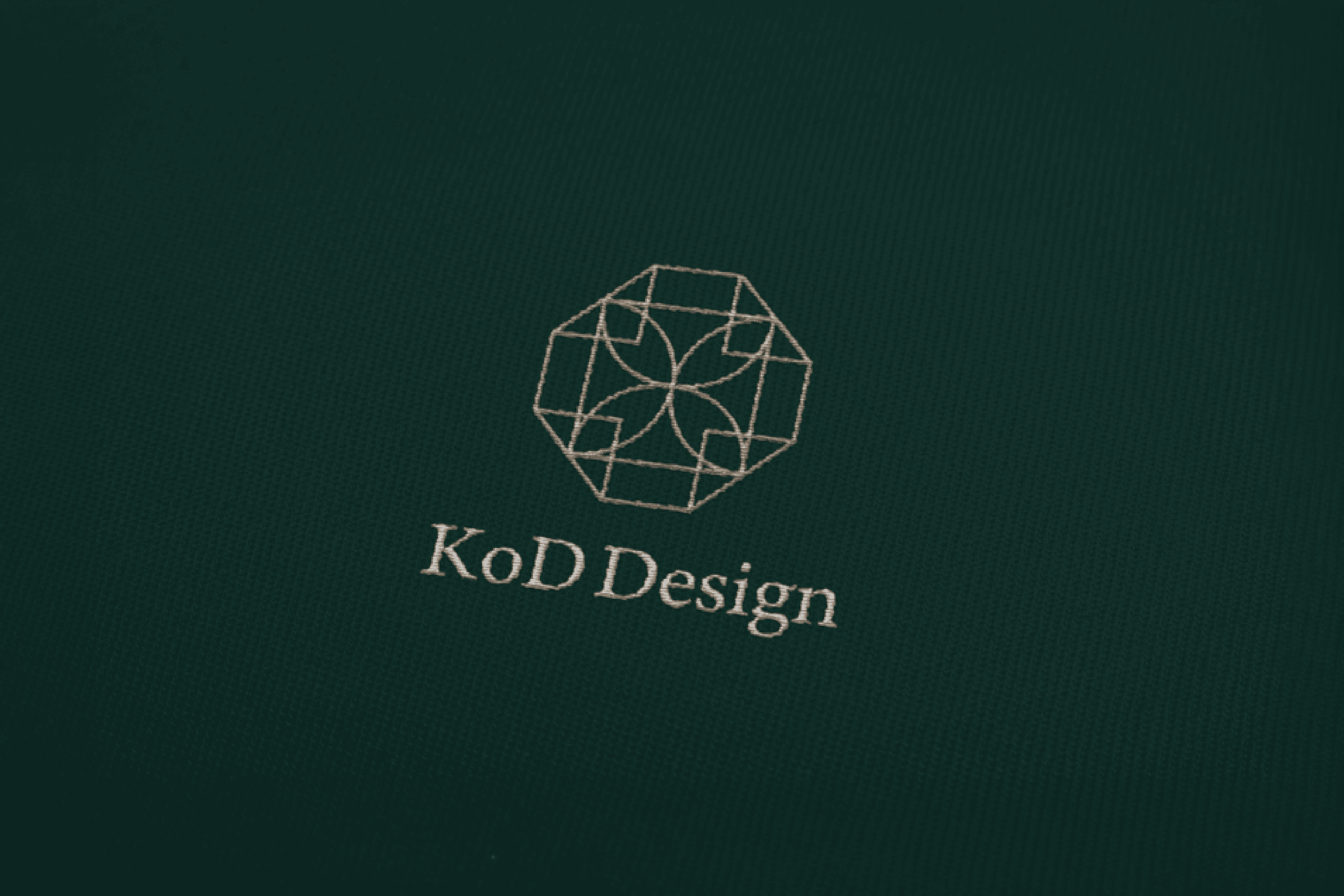
KOD is a brand that reinterprets traditional Korean gyubang crafts and bojagi wrapping through a contemporary perspective. The symbol was inspired by the form of a bojagi knot and the traditional pattern of Yeouiju Munbo, expressing the elegance of Korean craftsmanship with a modern aesthetic. Designed with clean and simple lines, the symbol offers versatility across embroidery, foil stamping, packaging, and printed materials. A sophisticated color palette of deep green and gold beige reflects the timeless beauty of traditional Korean culture, creating a calm and premium brand identity unique to KOD.
Client
KOD
Service
로고·브랜드 디자인
Date
2024