LocalizeHub CI 디자인
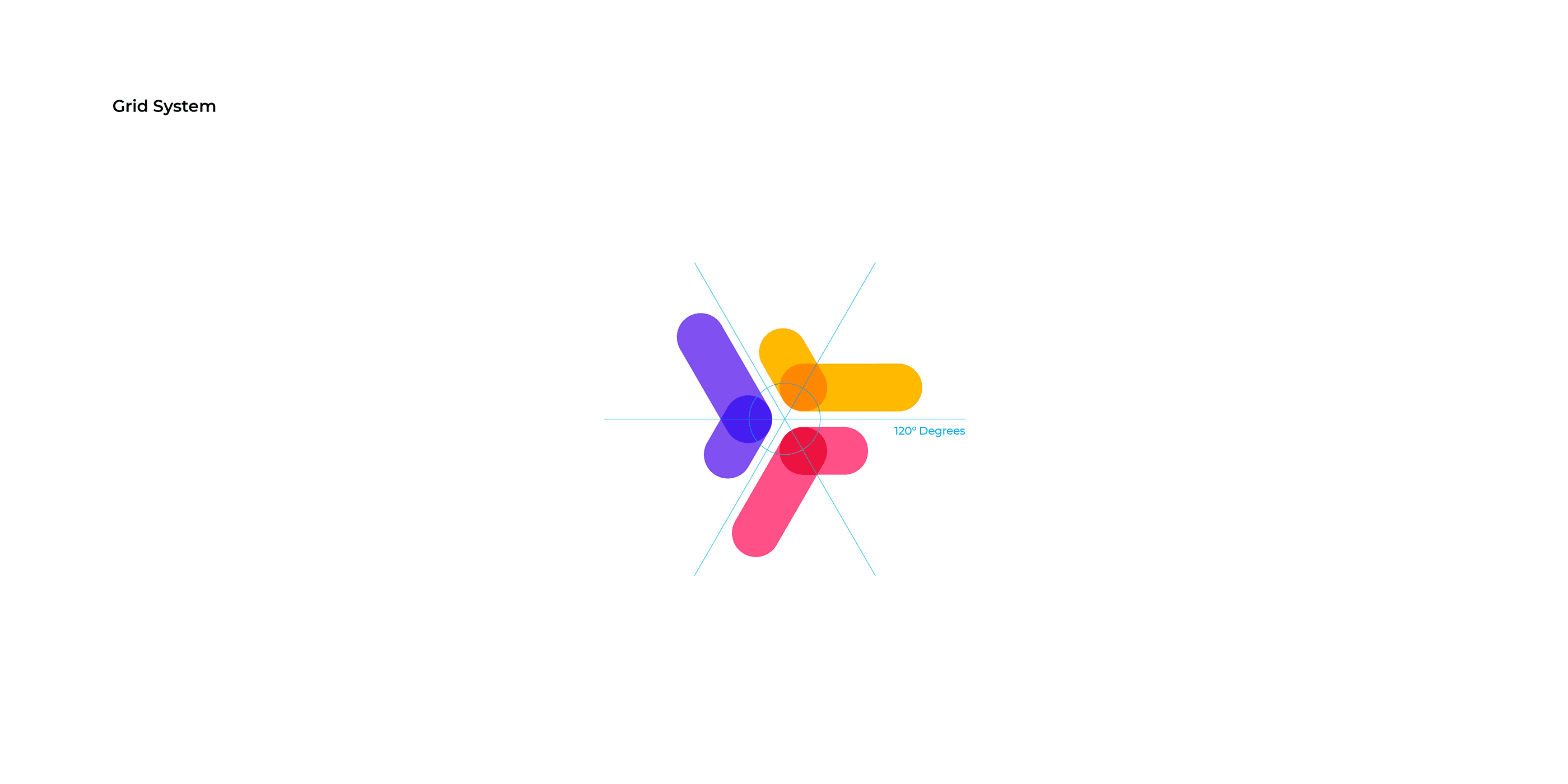
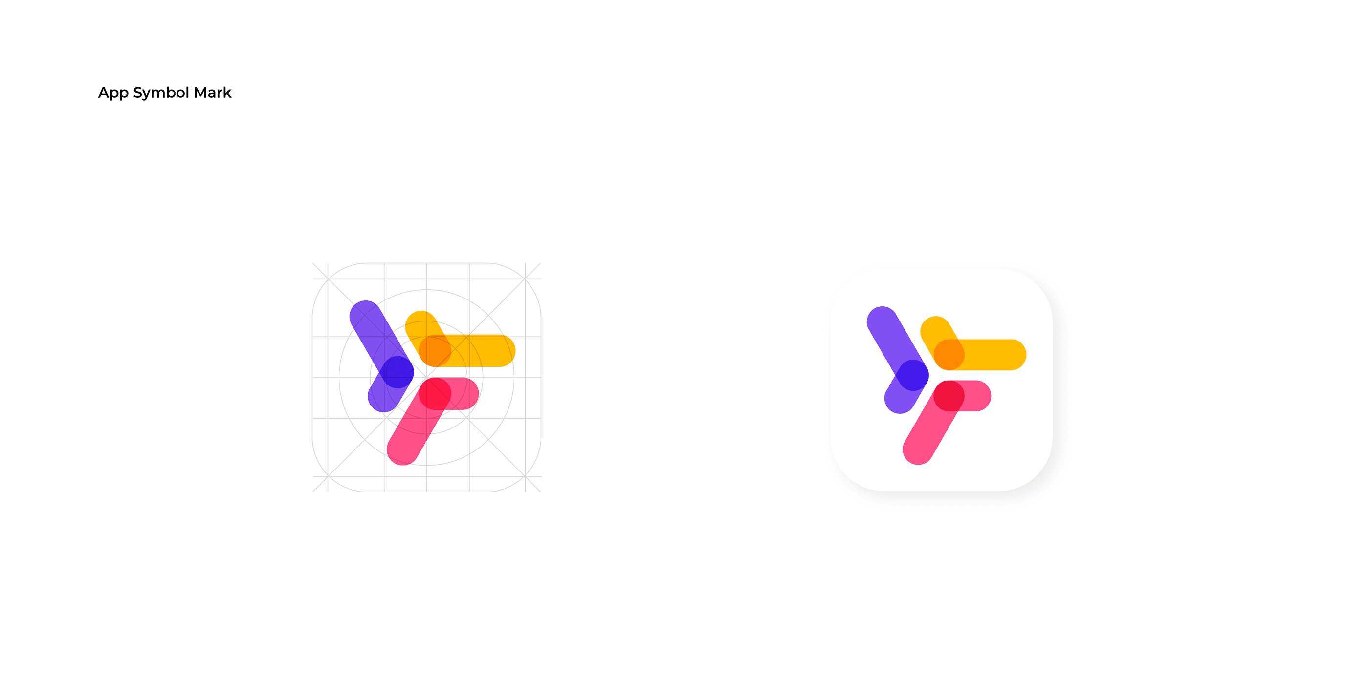
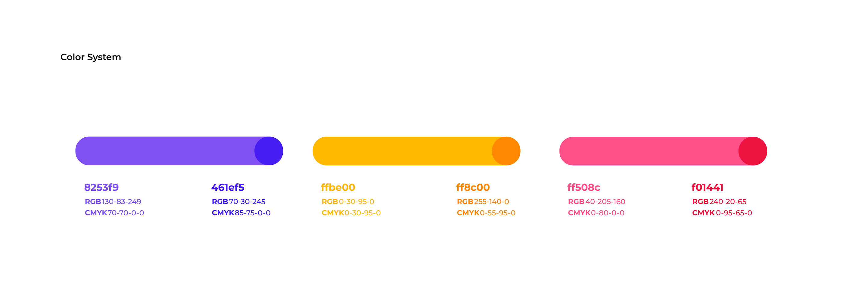
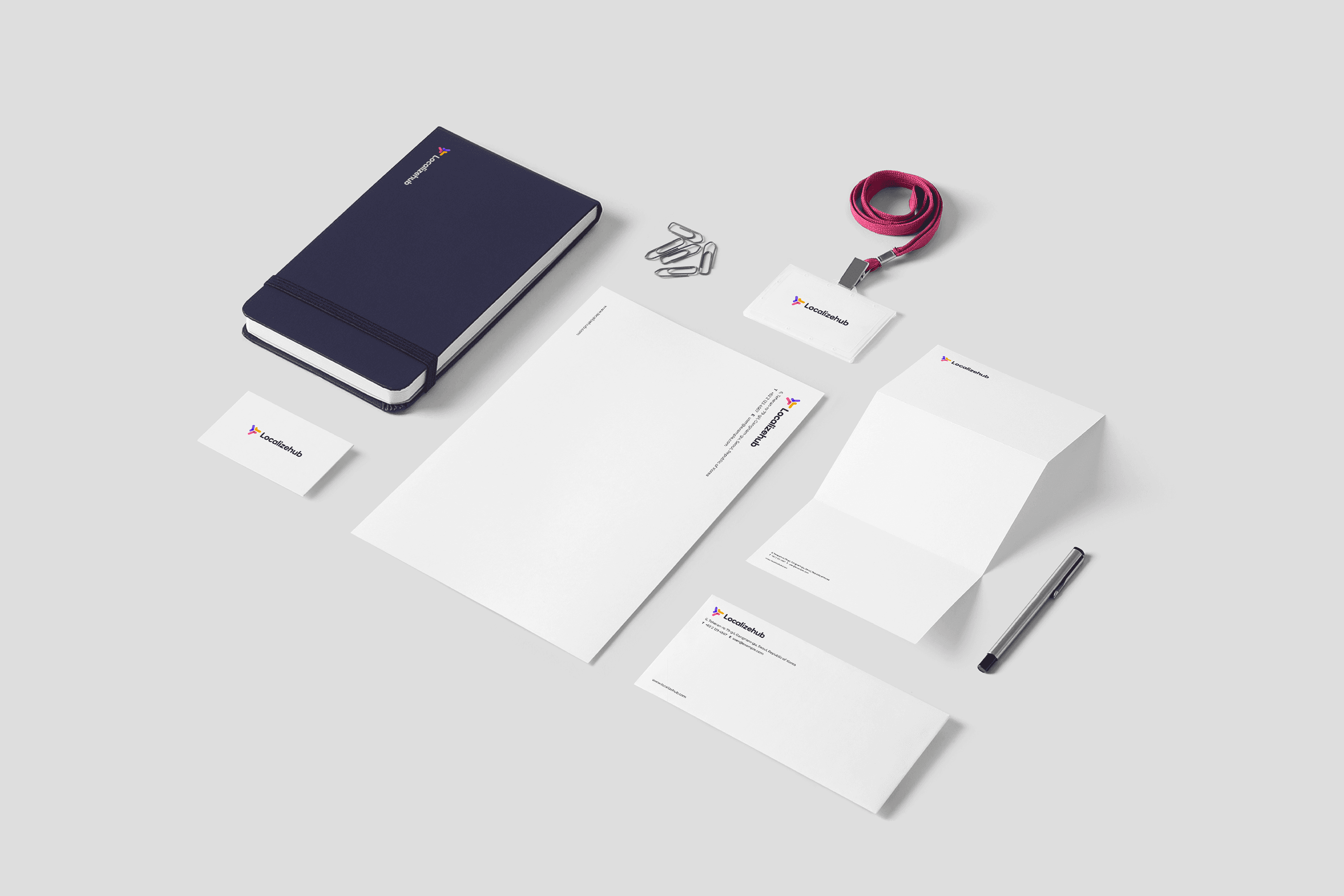
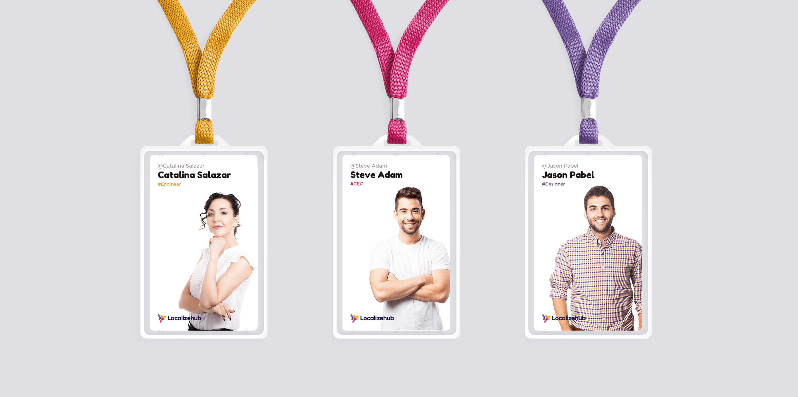
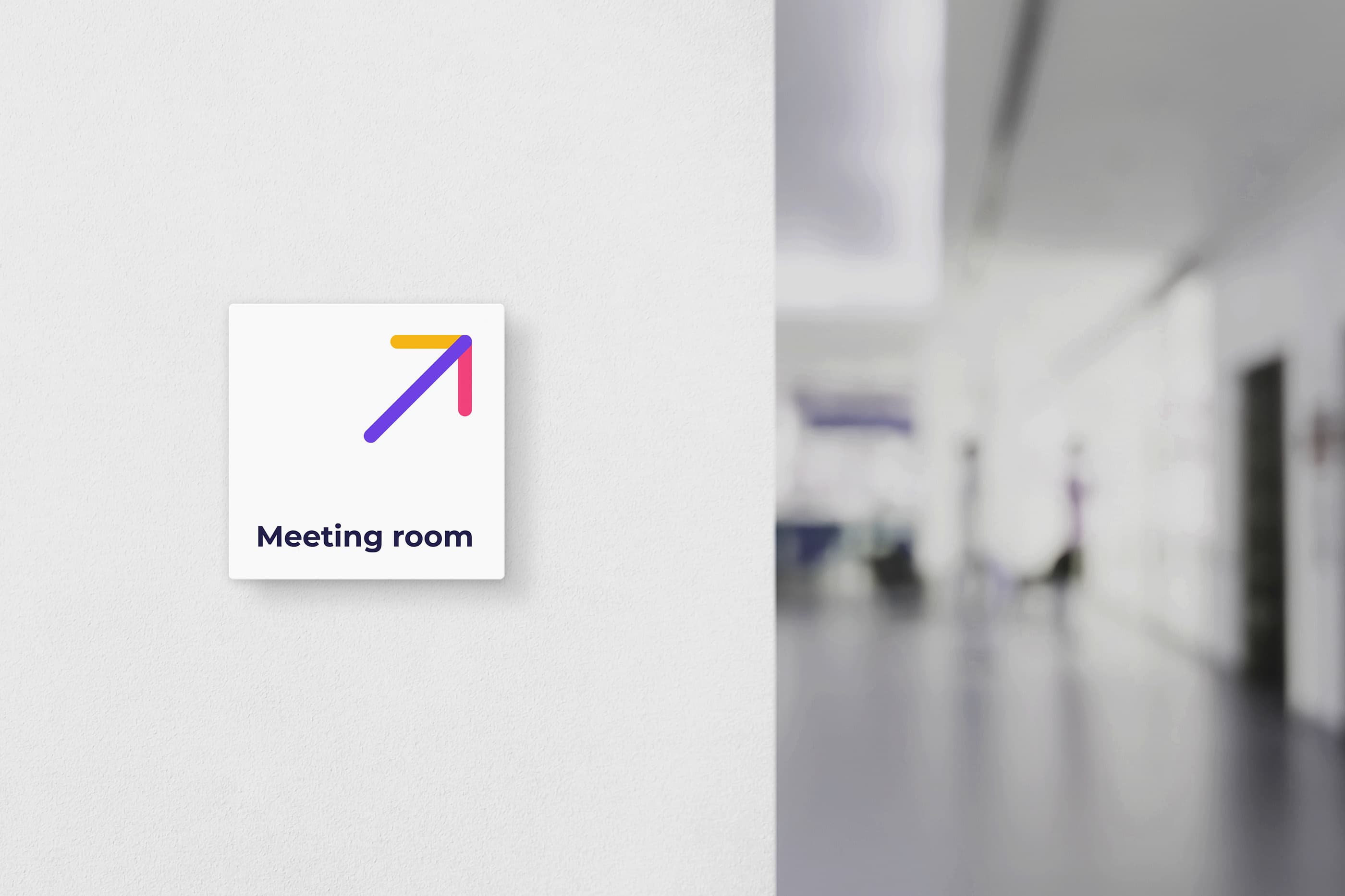
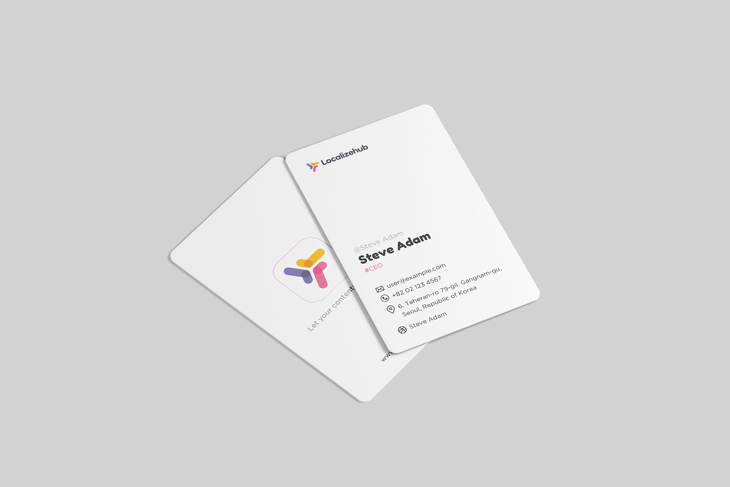
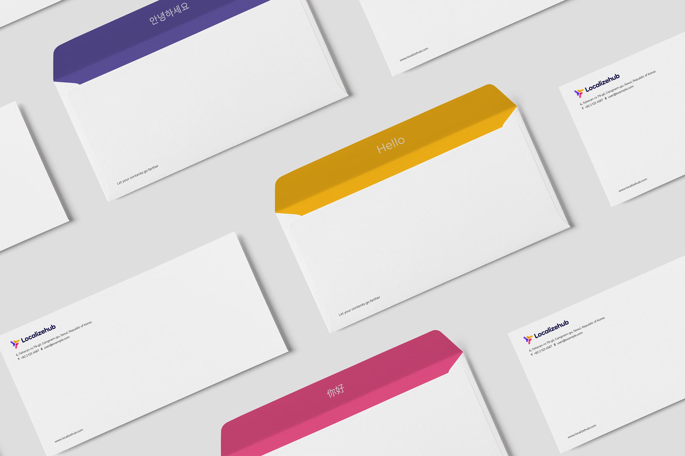
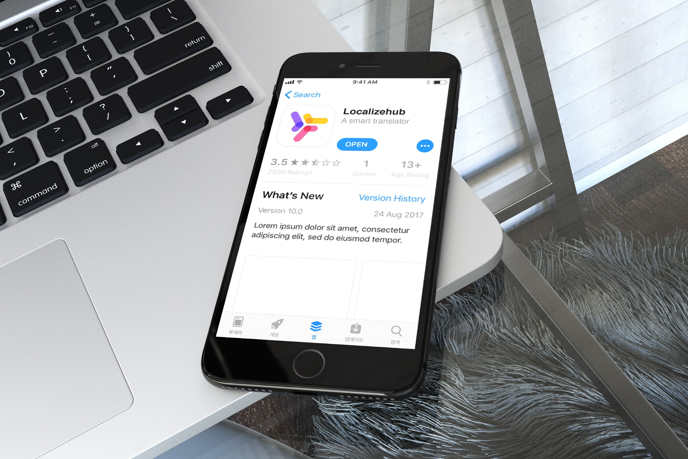
Localizehub는 다양한 언어와 문화를 연결하는 글로벌 번역 플랫폼입니다. 심벌은 브랜드명인 Localizehub와 Language의 이니셜 'L'을 모티브로 디자인하였으며, 서로 연결되고 순환하는 형태를 통해 다양한 언어가 자연스럽게 소통되는 과정을 표현했습니다. 다채로운 컬러는 세계 각국의 다양한 언어와 문화를 상징하며, 간결한 심벌 구조를 통해 정확하고 명확한 번역 서비스의 이미지를 전달합니다.
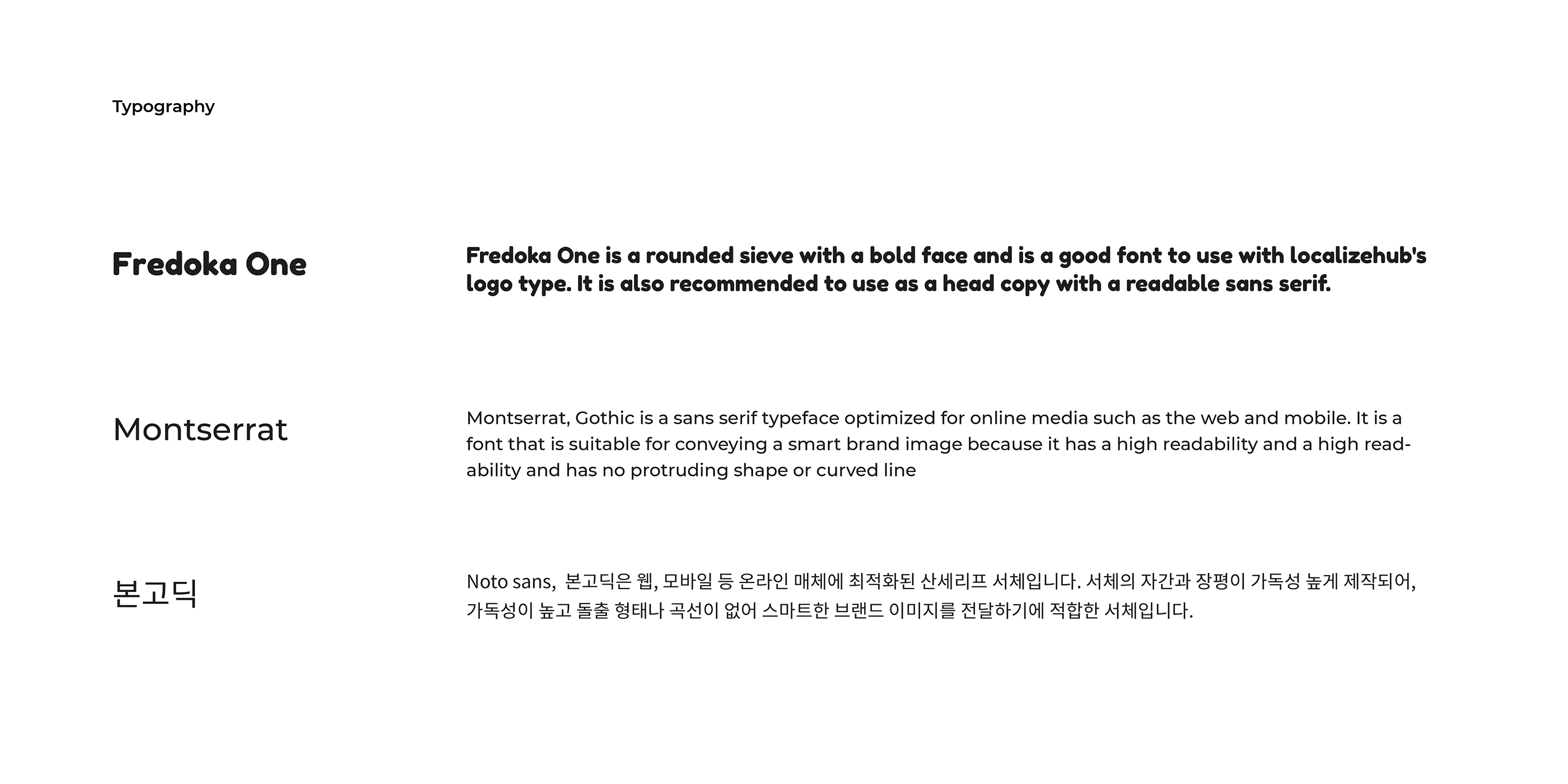
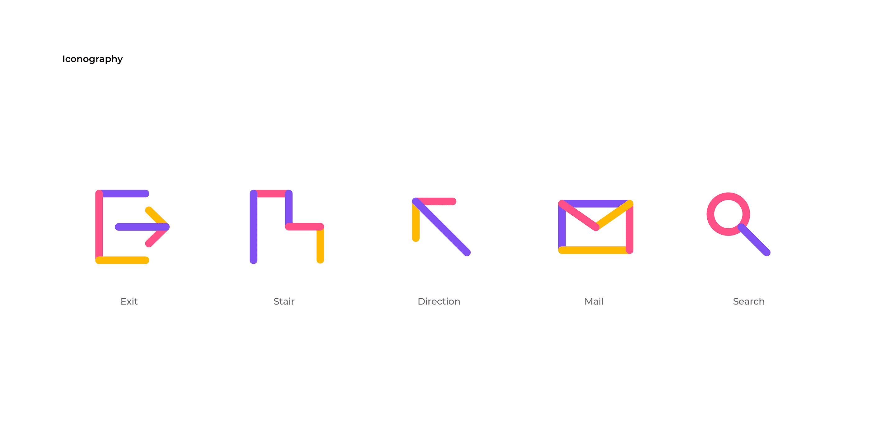
Localizehub is a global translation platform that connects people through language and communication. The symbol was inspired by the initial letter "L" from both Localizehub and Language, forming a continuous and interconnected shape that represents the seamless flow of communication across different languages. The vibrant color palette symbolizes the diversity of languages and cultures around the world, while the clean symbol conveys clarity, accuracy, and reliability in translation. Bold forms and rounded edges create a friendly and approachable visual identity.
Client
LocalizeHub
Service
로고·브랜드 디자인
Date
2024