카페·식당← 목록으로
홍콩다방 BI 디자인
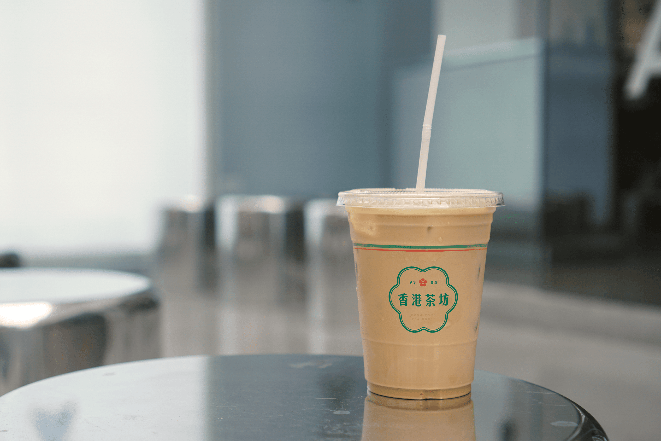
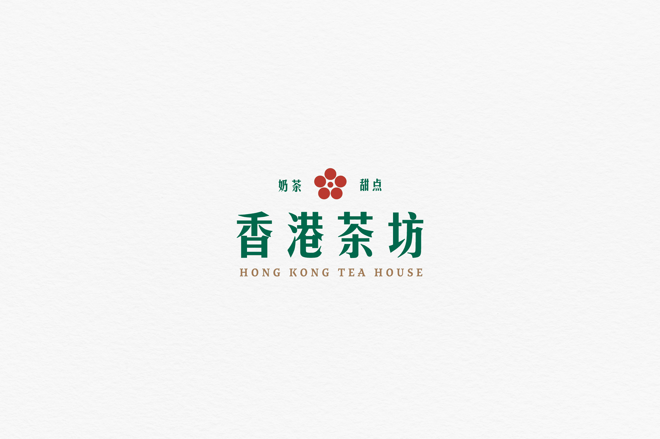
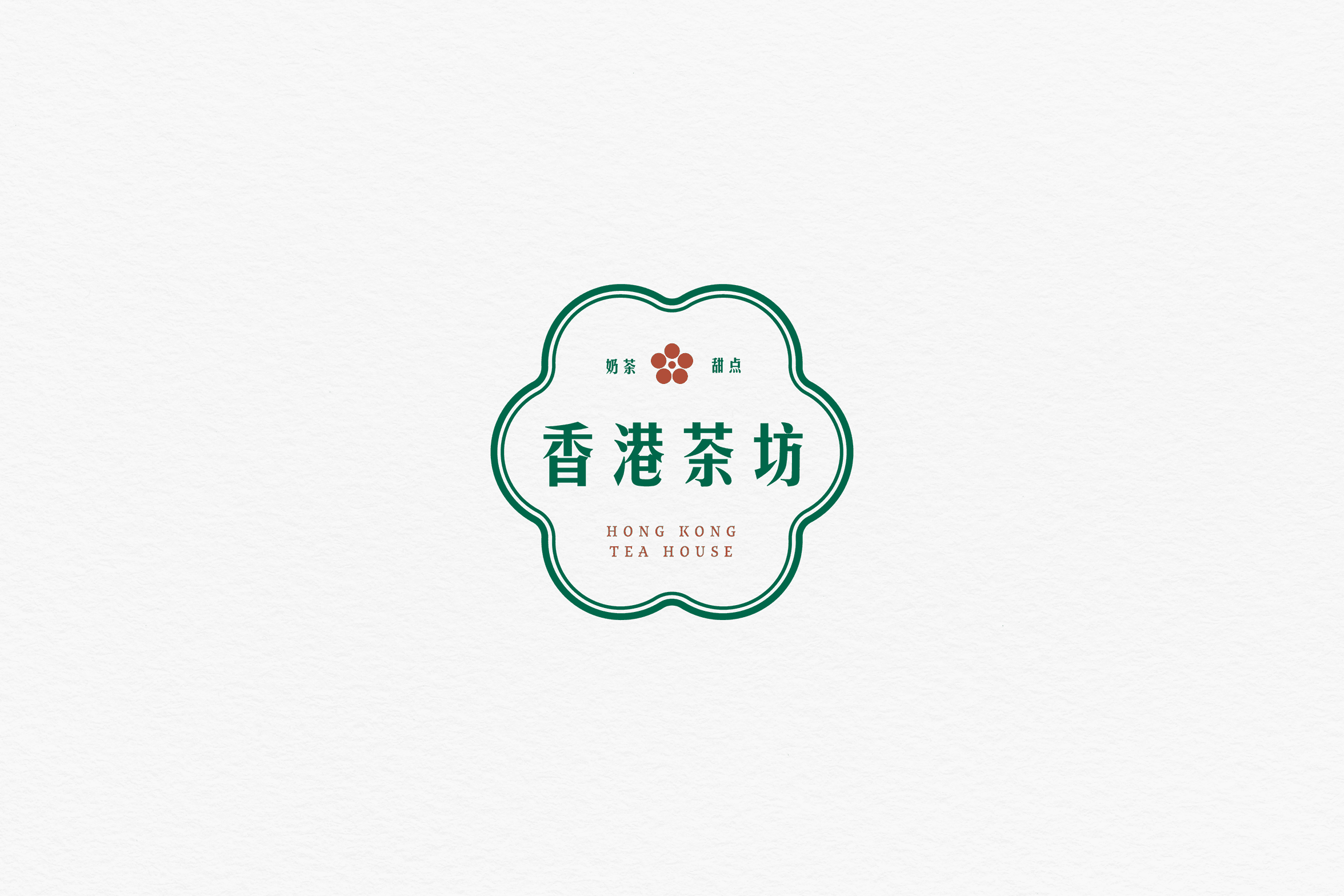
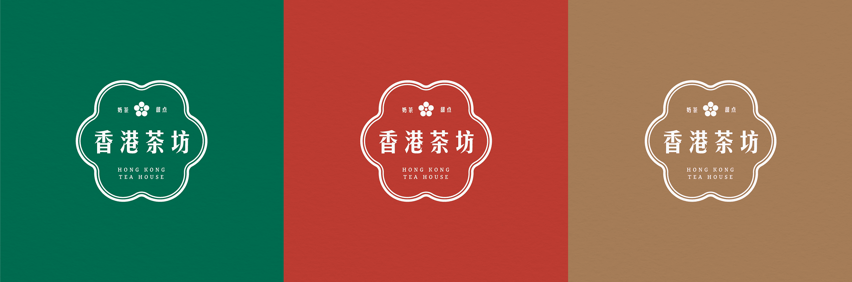
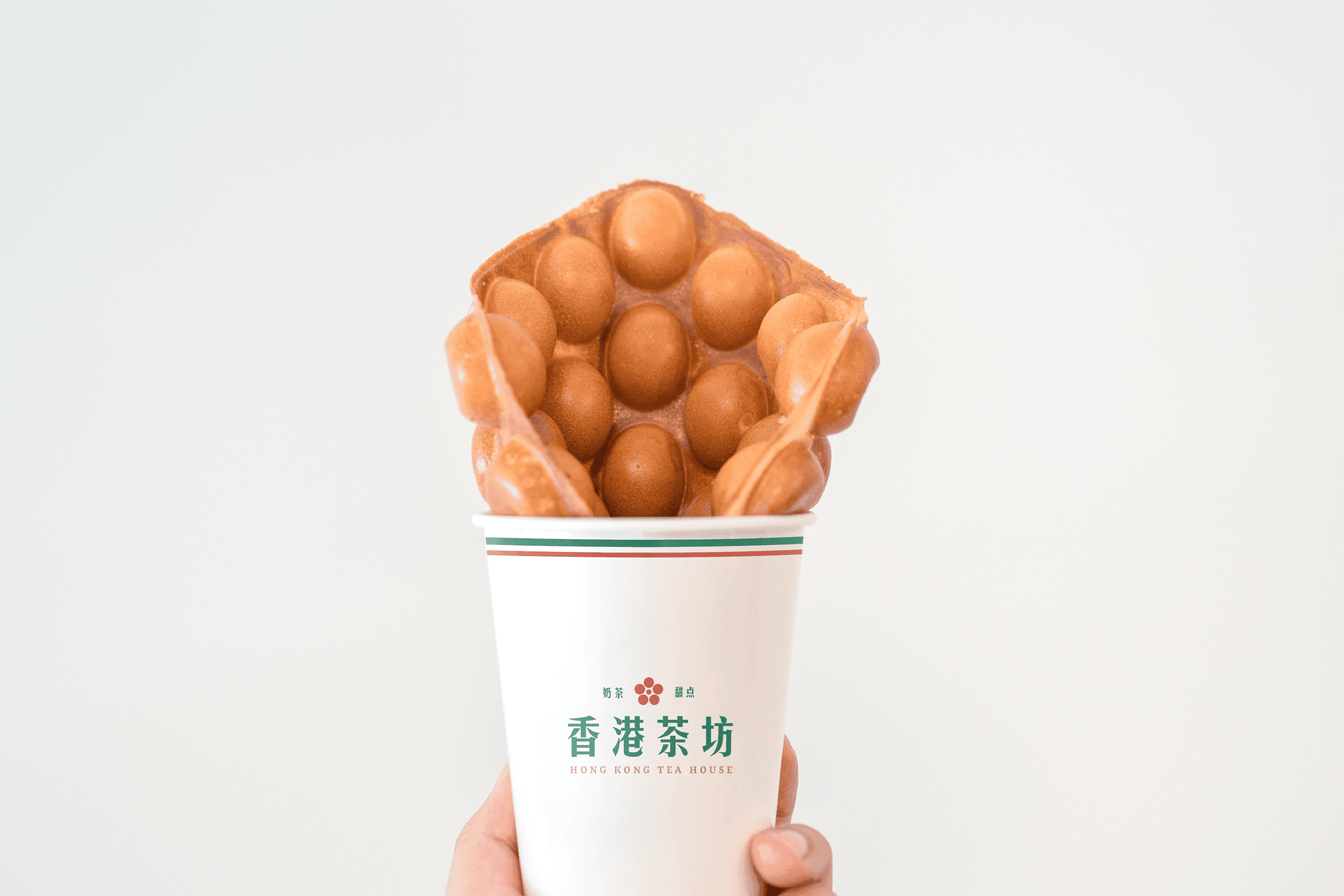
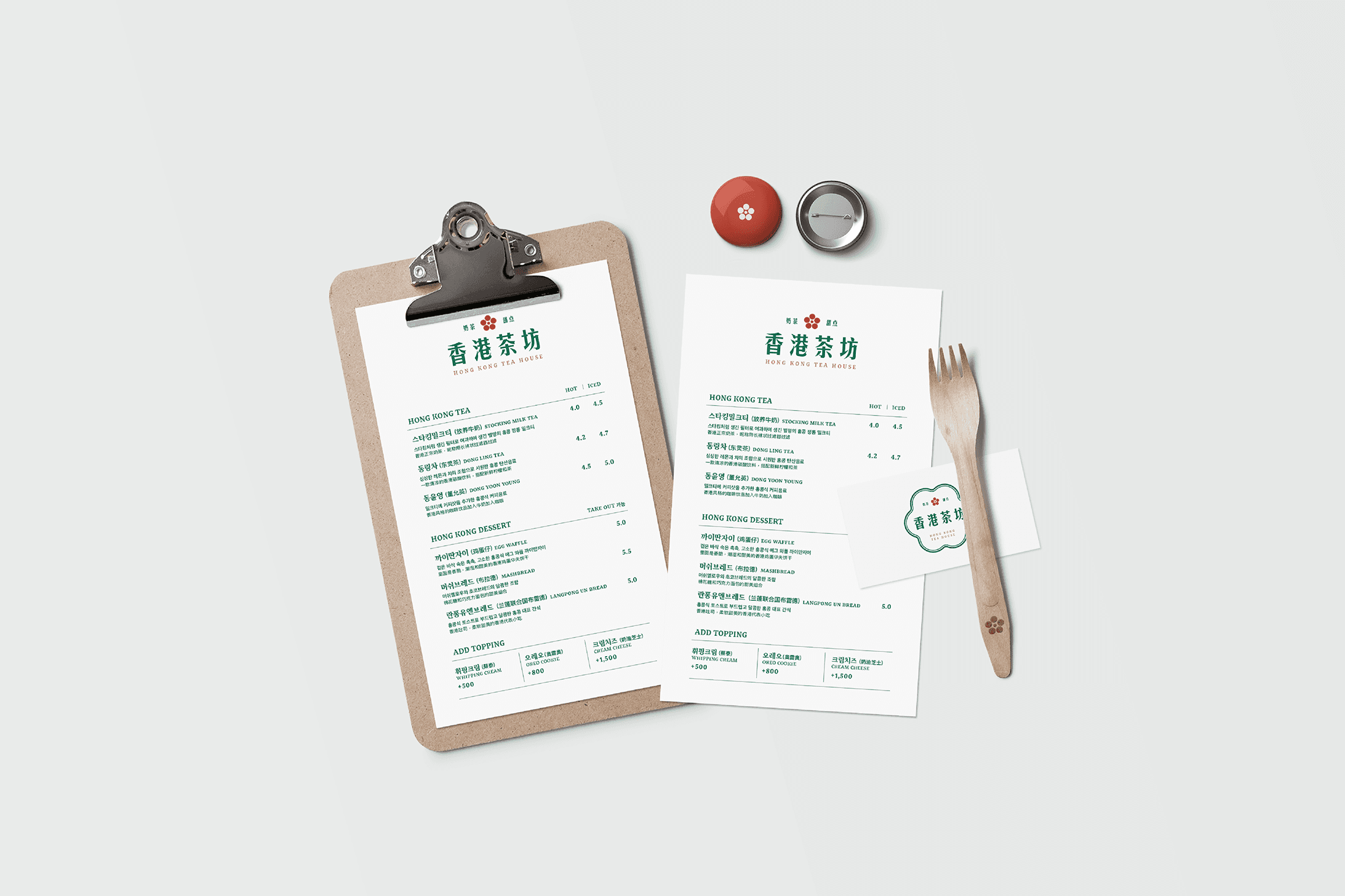
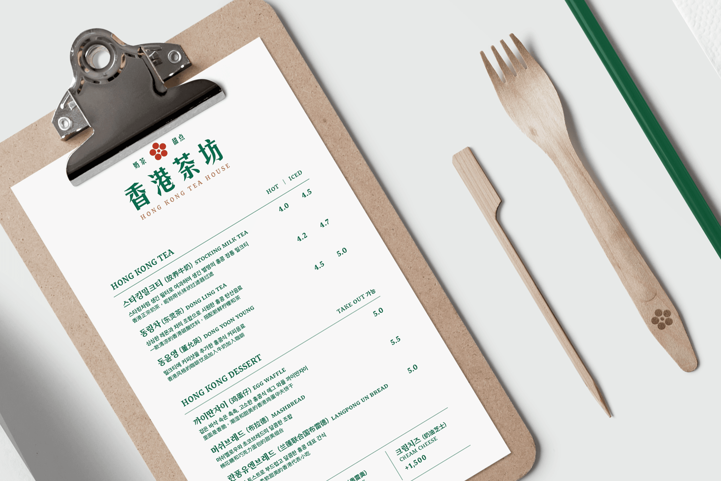
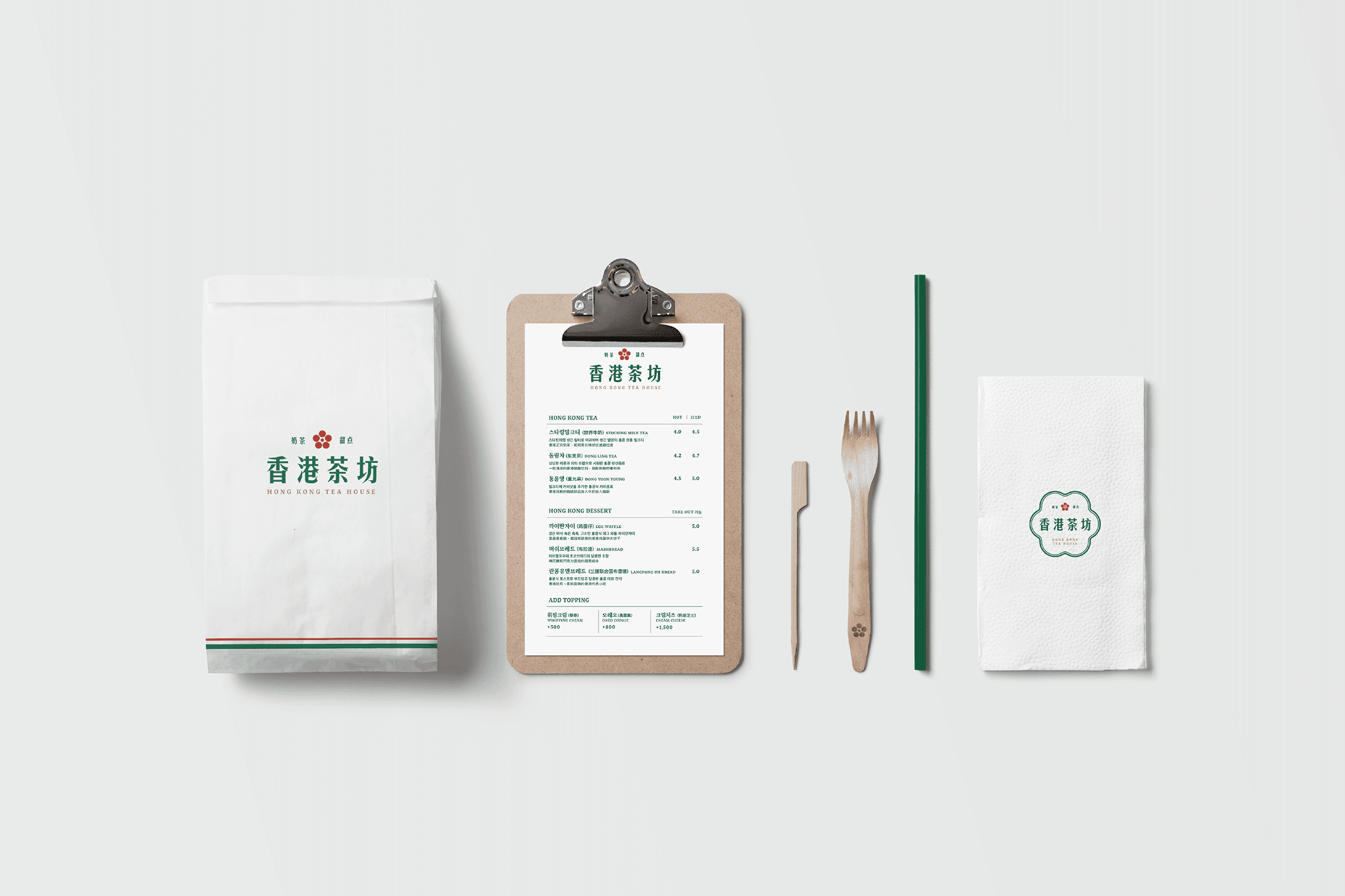
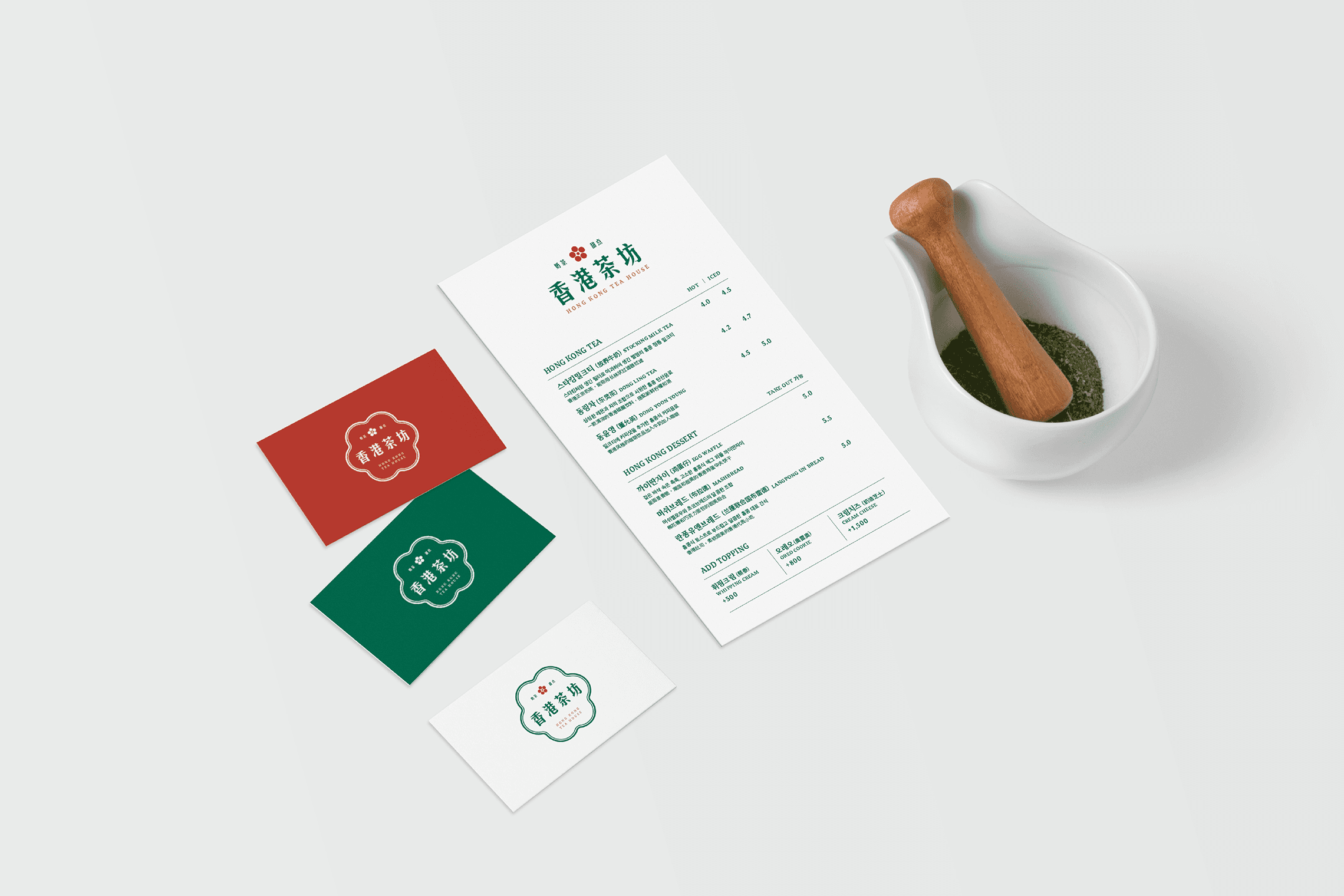
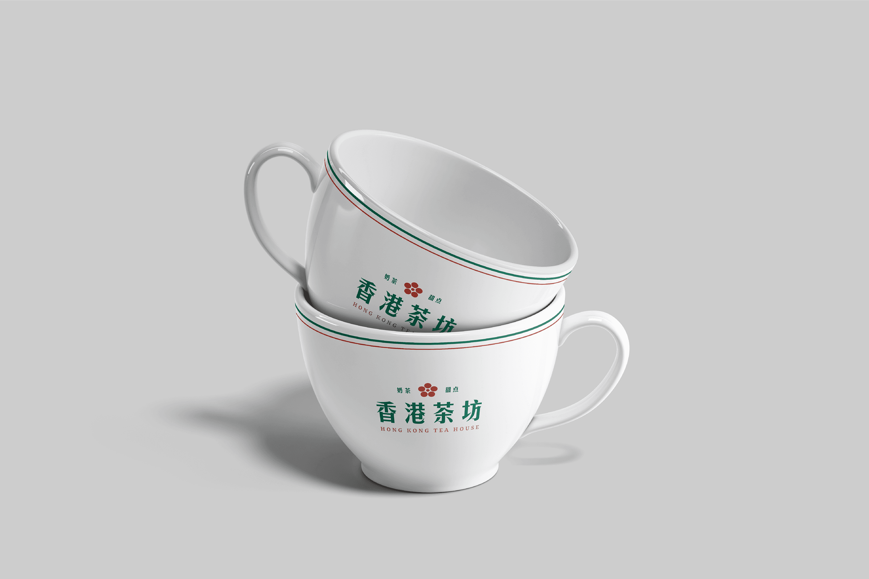
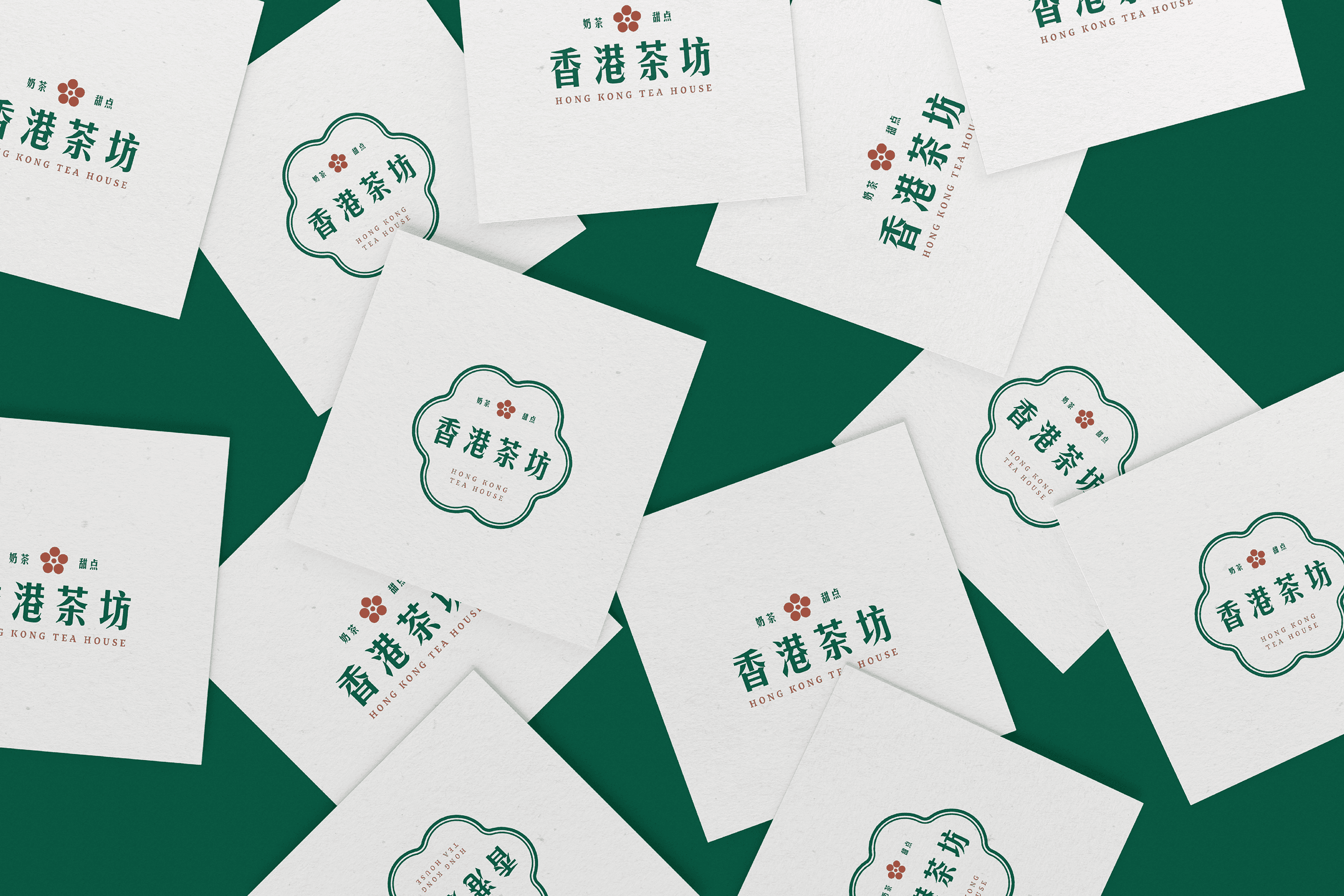
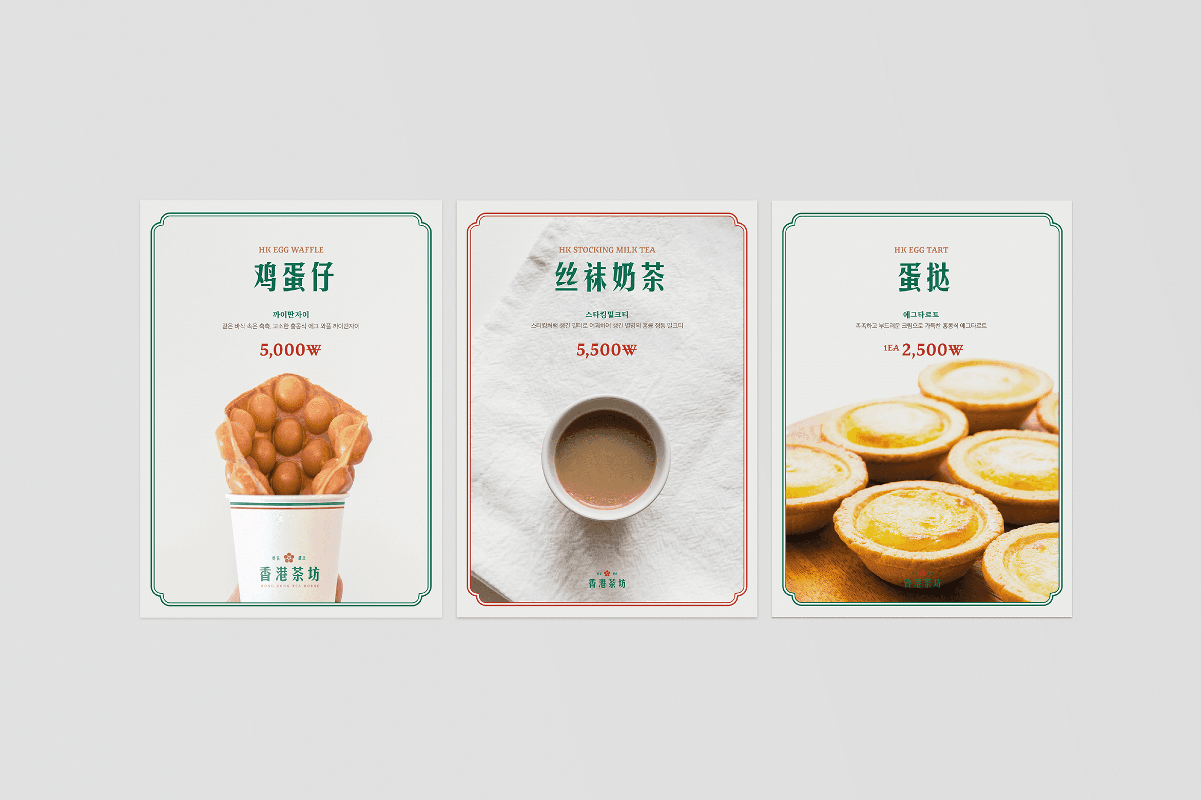
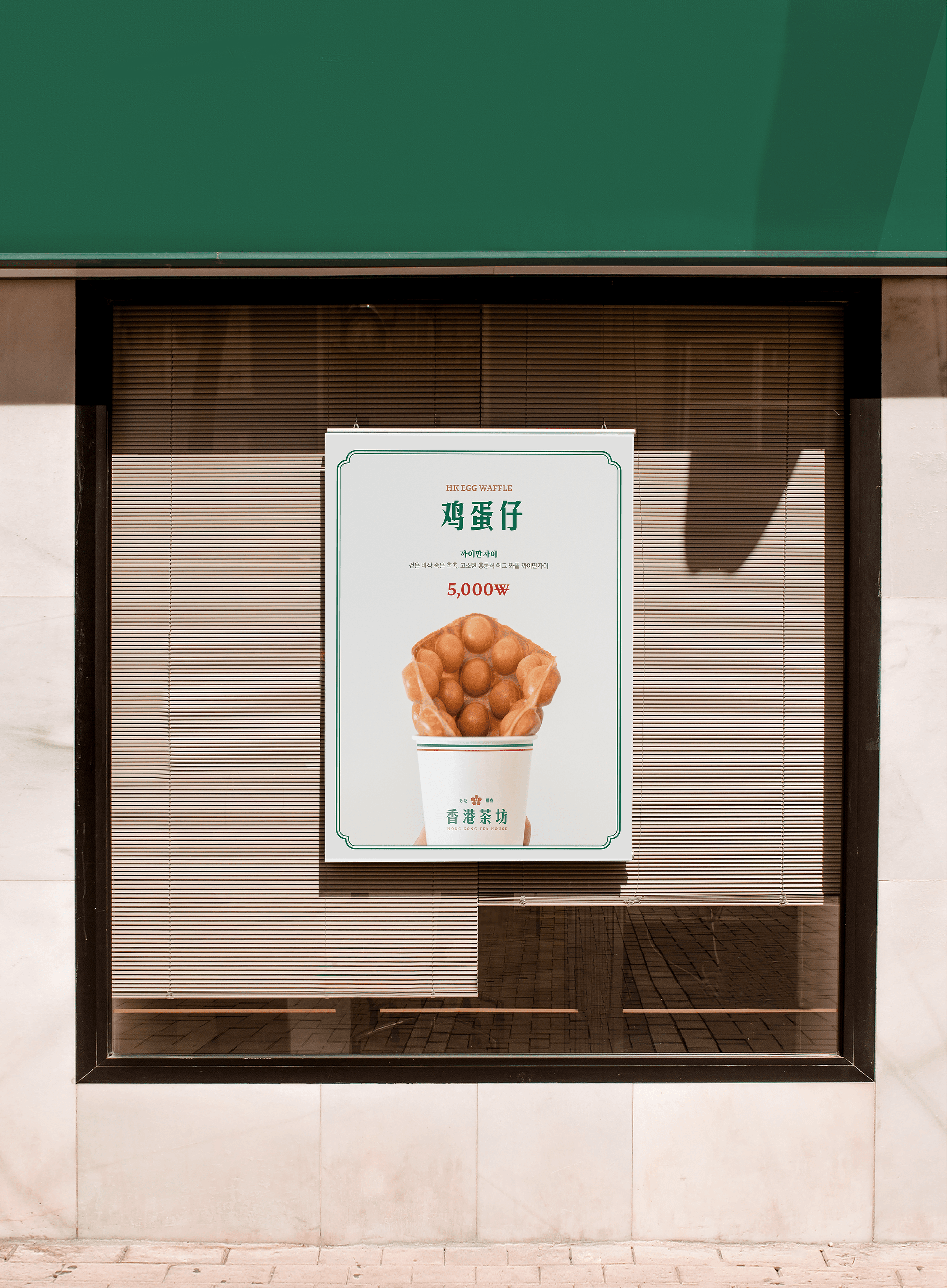
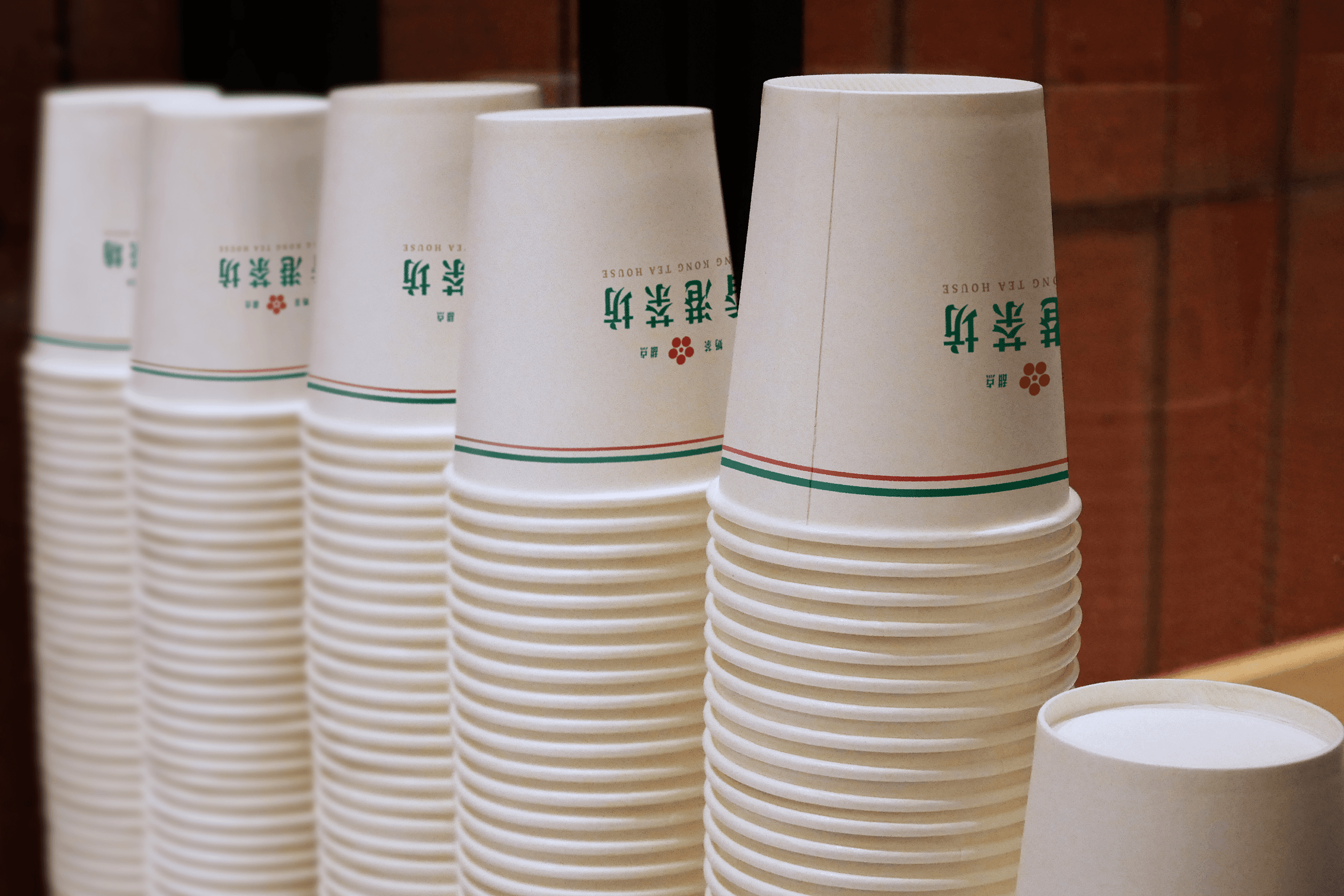
홍콩 에그와플과 밀크티를 전문으로 하는 홍콩다방의 브랜드 아이덴티티를 구축했습니다. 홍콩 국기의 상징인 꽃과 에그와플의 둥근 실루엣을 결합해 심벌을 개발했으며, 홍콩 현지의 분위기를 전달할 수 있도록 란퐁유엔의 시그니처 컬러에서 영감을 받은 컬러 시스템을 적용했습니다. 이를 통해 홍콩다방만의 친근하면서도 이국적인 브랜드 이미지를 완성했습니다.
Hong Kong Dabang is a specialty café brand focused on Hong Kong-style egg waffles and milk tea. The visual identity was developed by combining the symbolic flower of the Hong Kong flag with the signature circular form of traditional egg waffles. Colors inspired by the iconic palette of Lan Fong Yuen were applied to reinforce the brand's authenticity and create a distinctive identity that reflects the charm and culture of Hong Kong.
Client
홍콩다방
Service
로고·브랜드 디자인
Date
2024