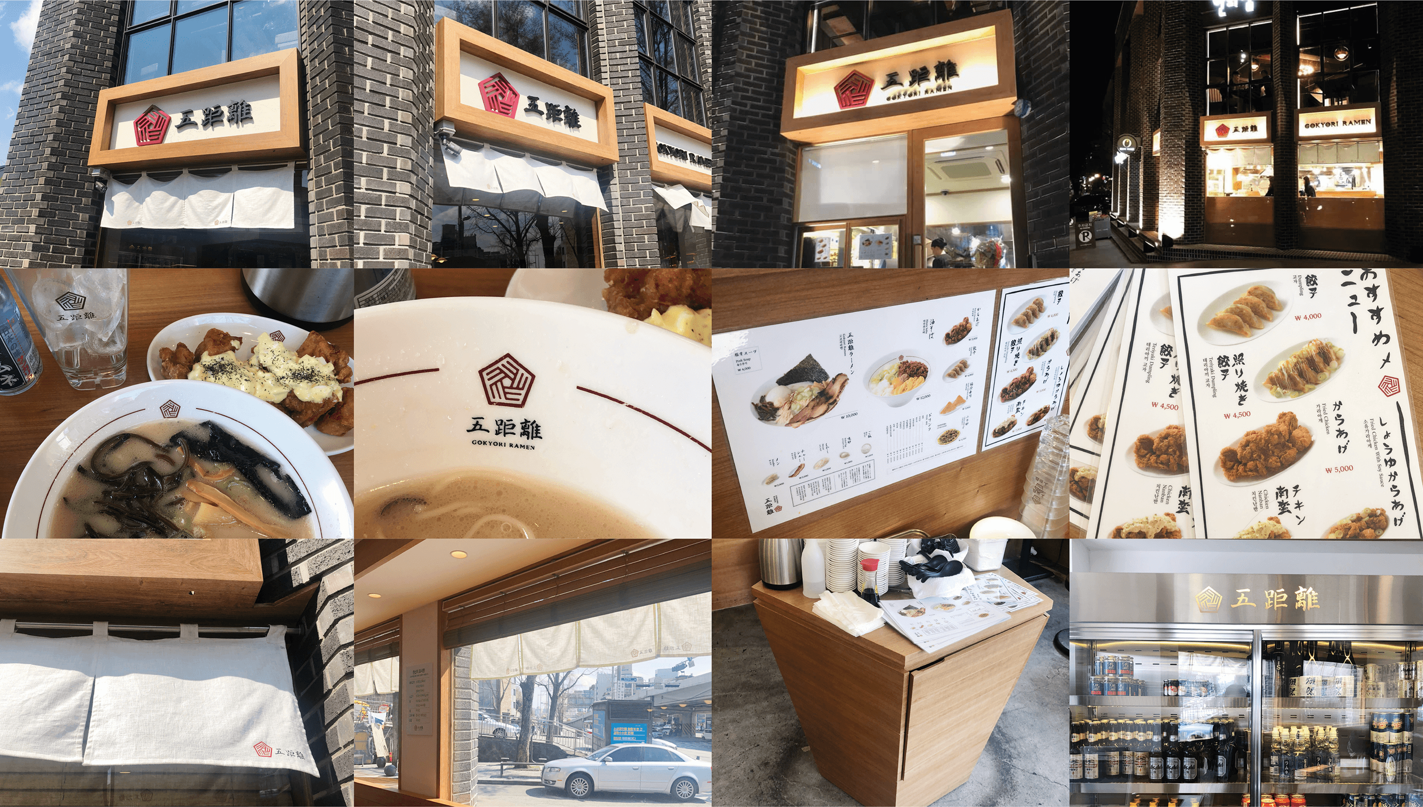
교코리라멘 BI 디자인
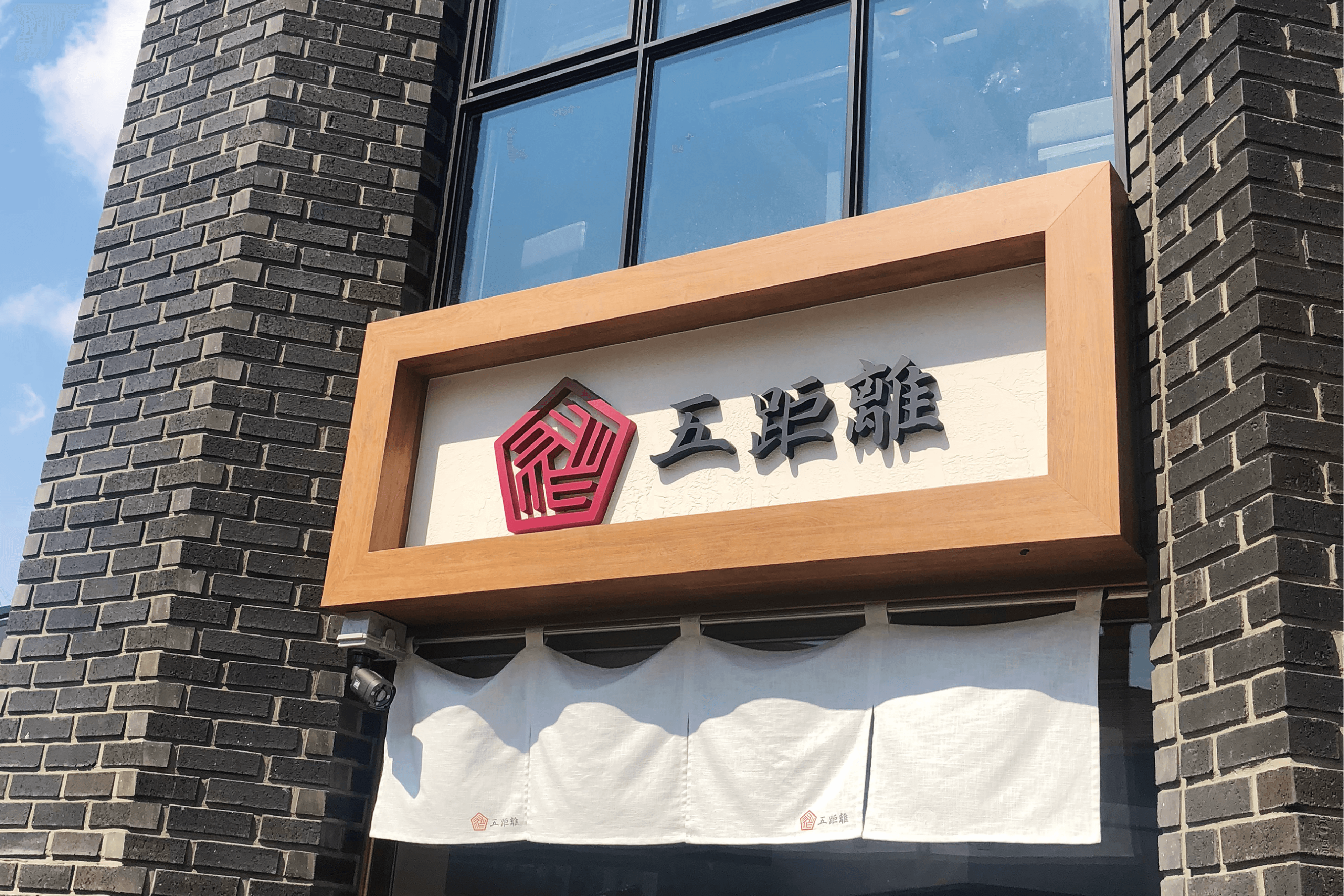
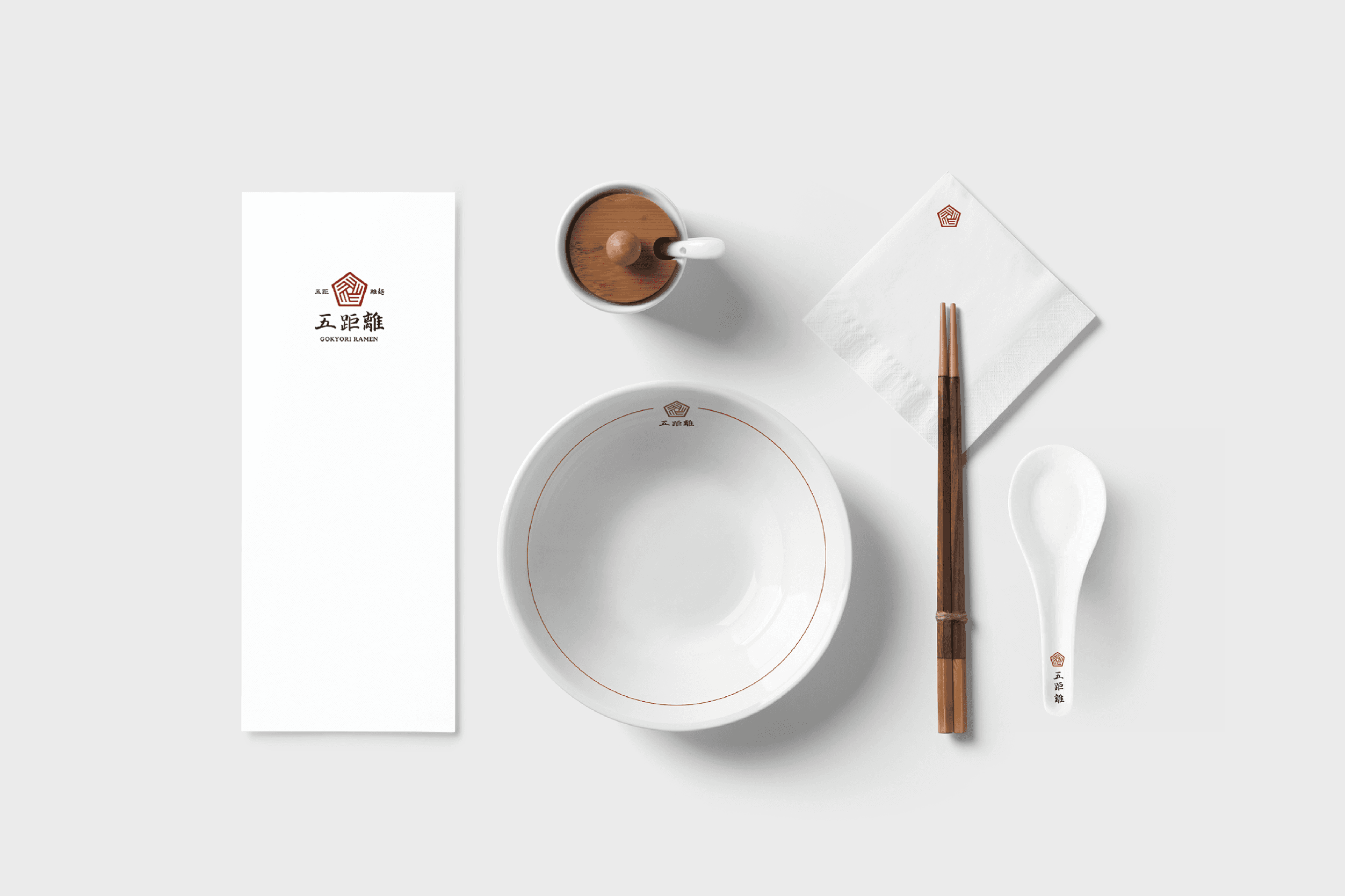
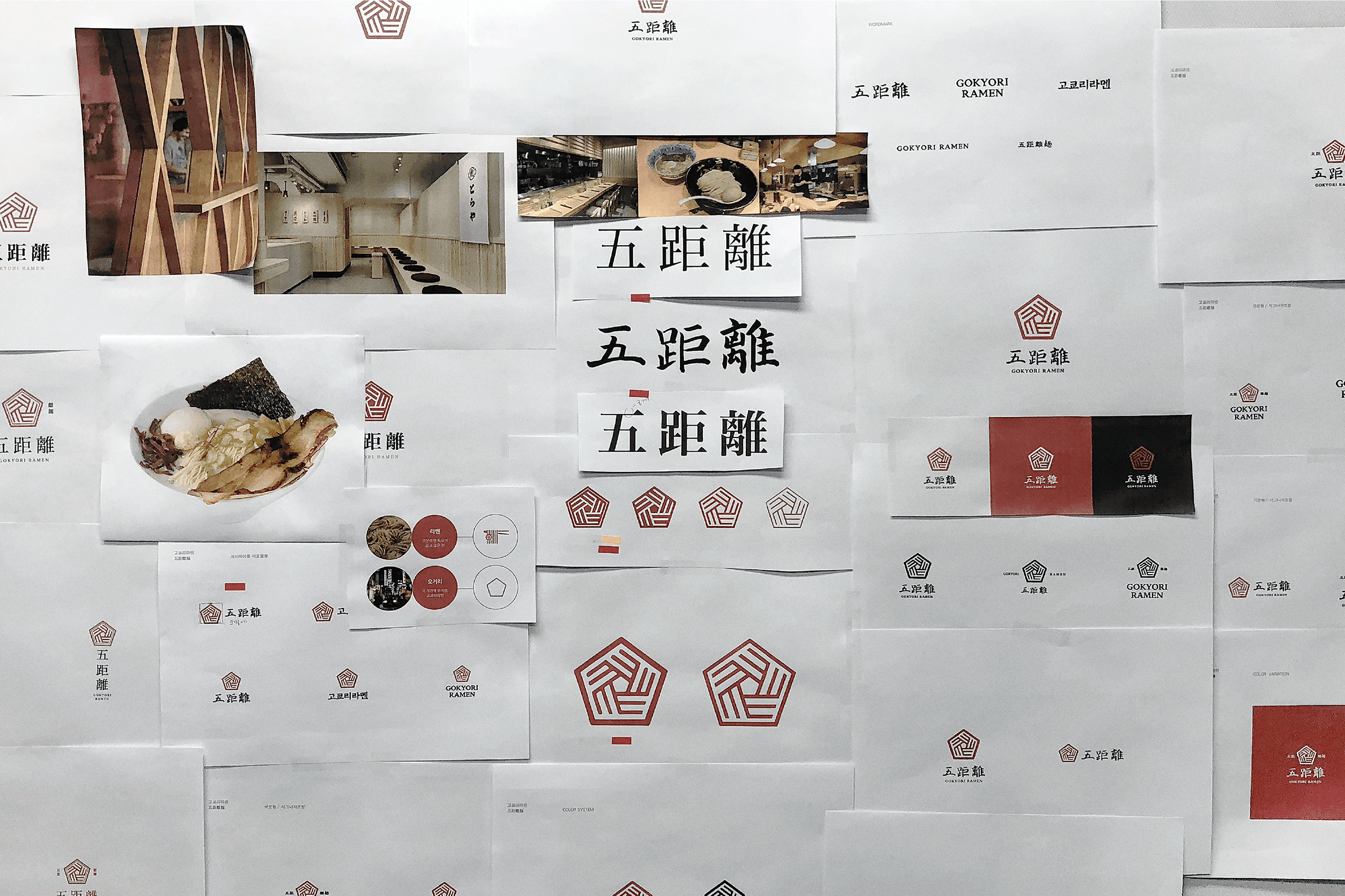
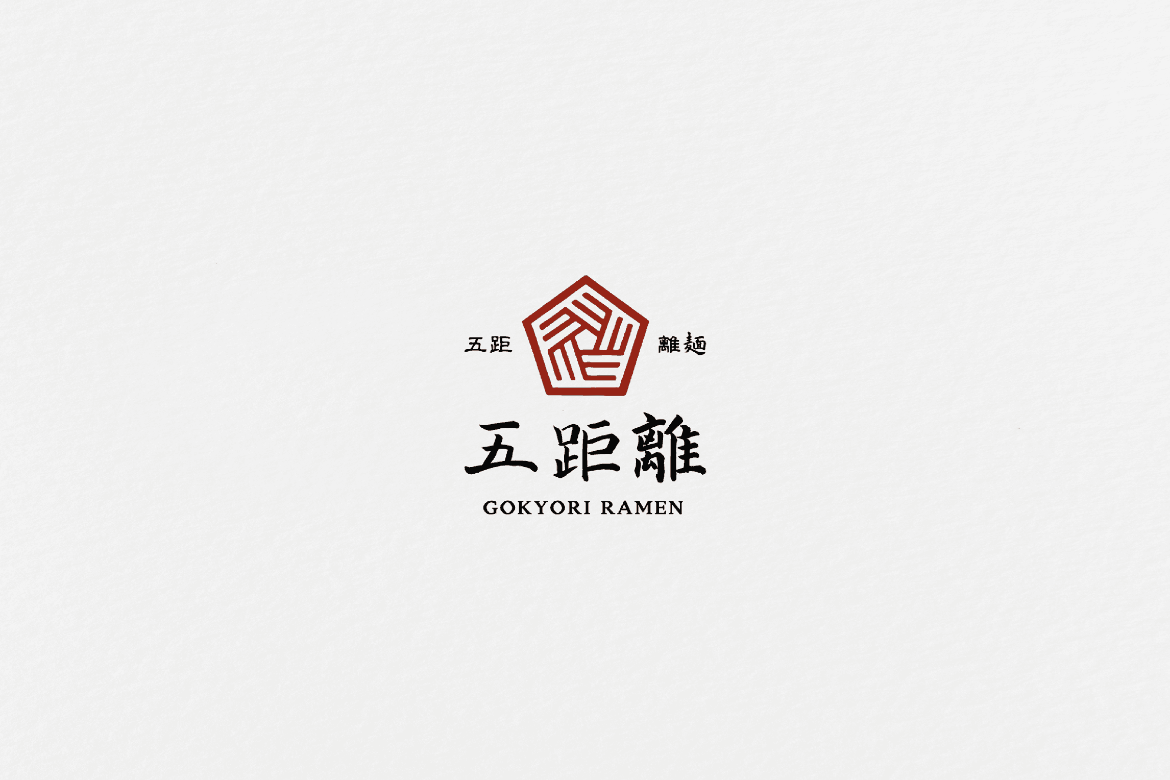
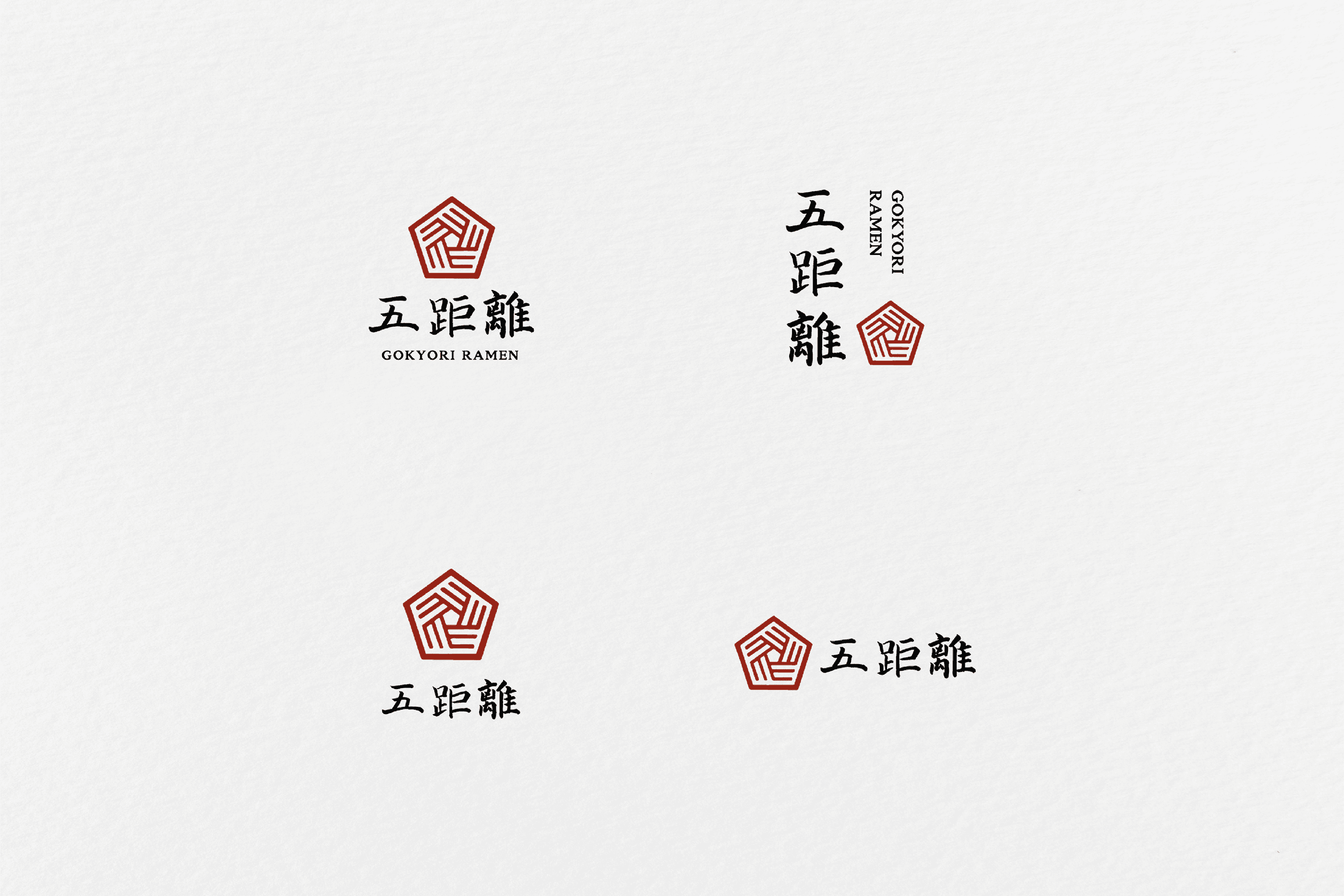
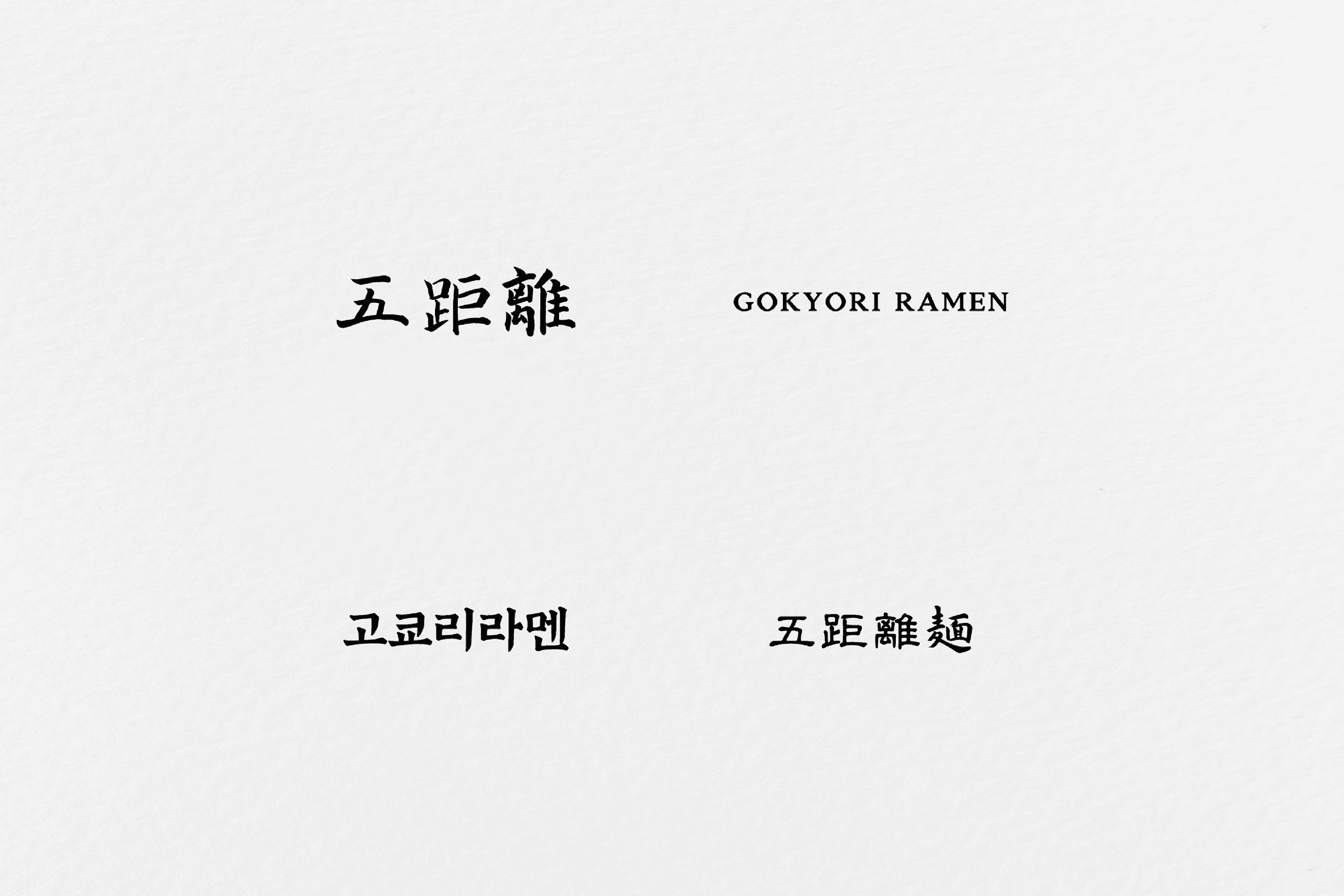
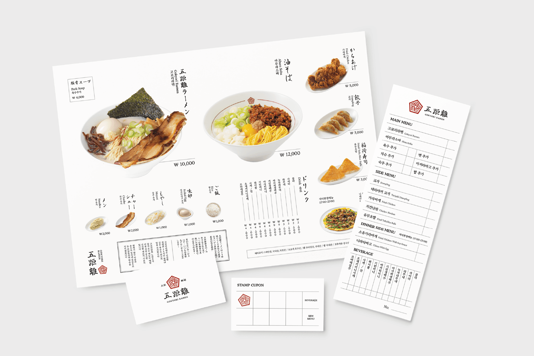
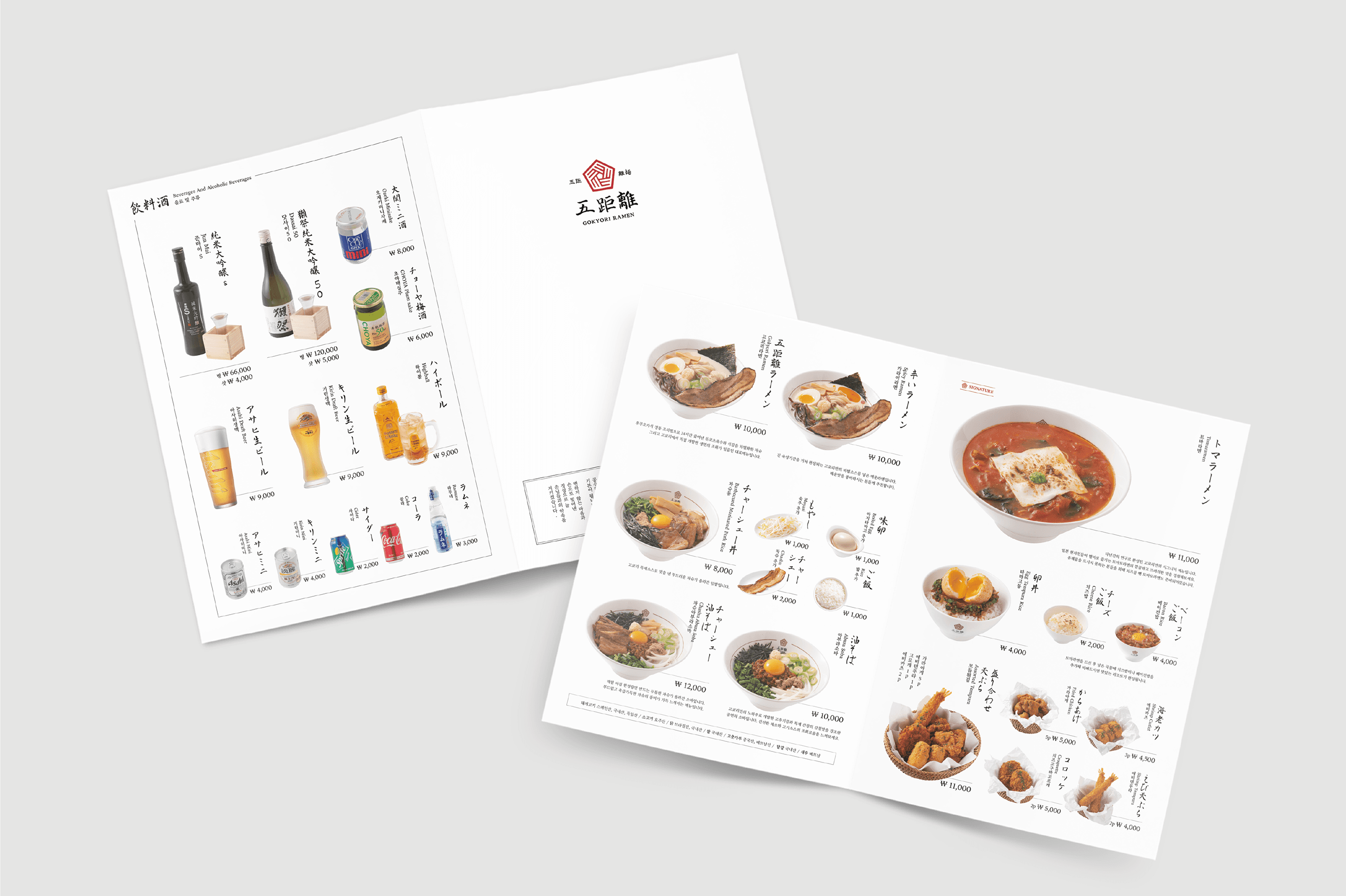
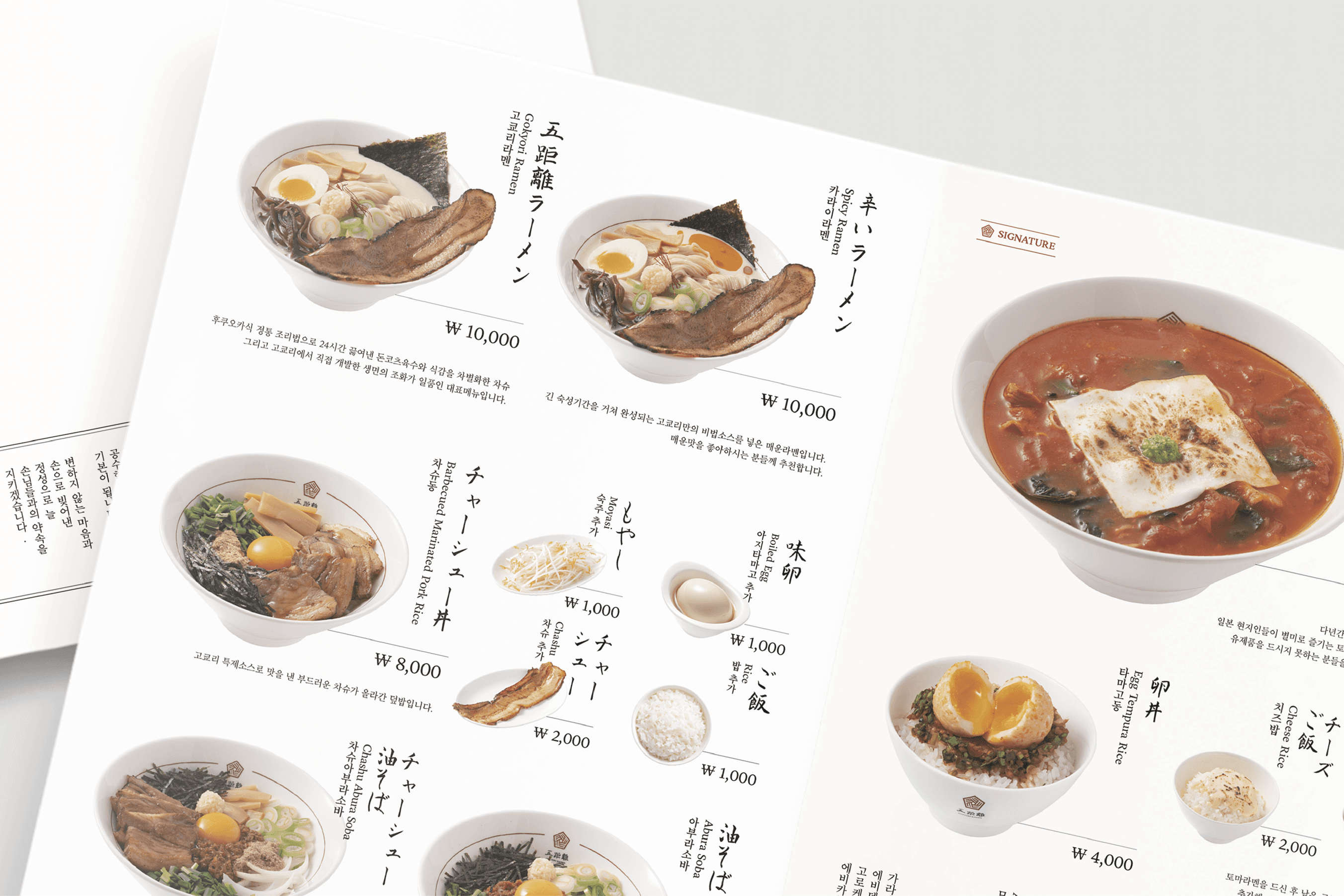
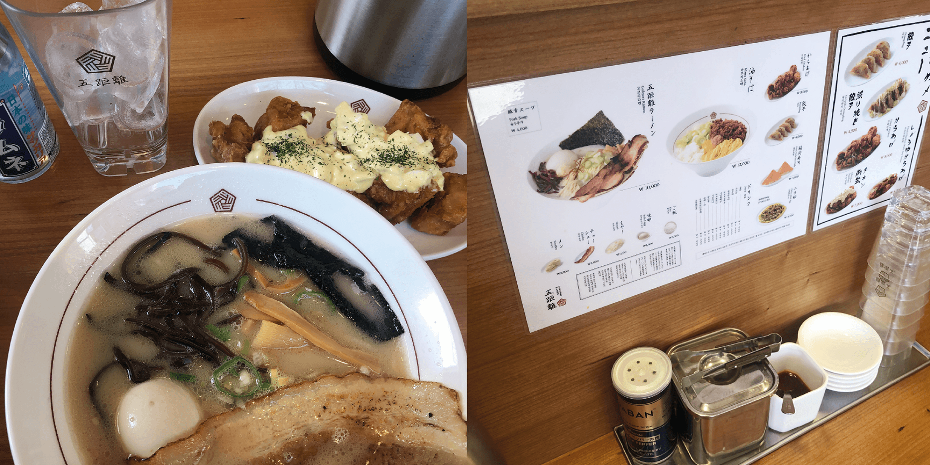
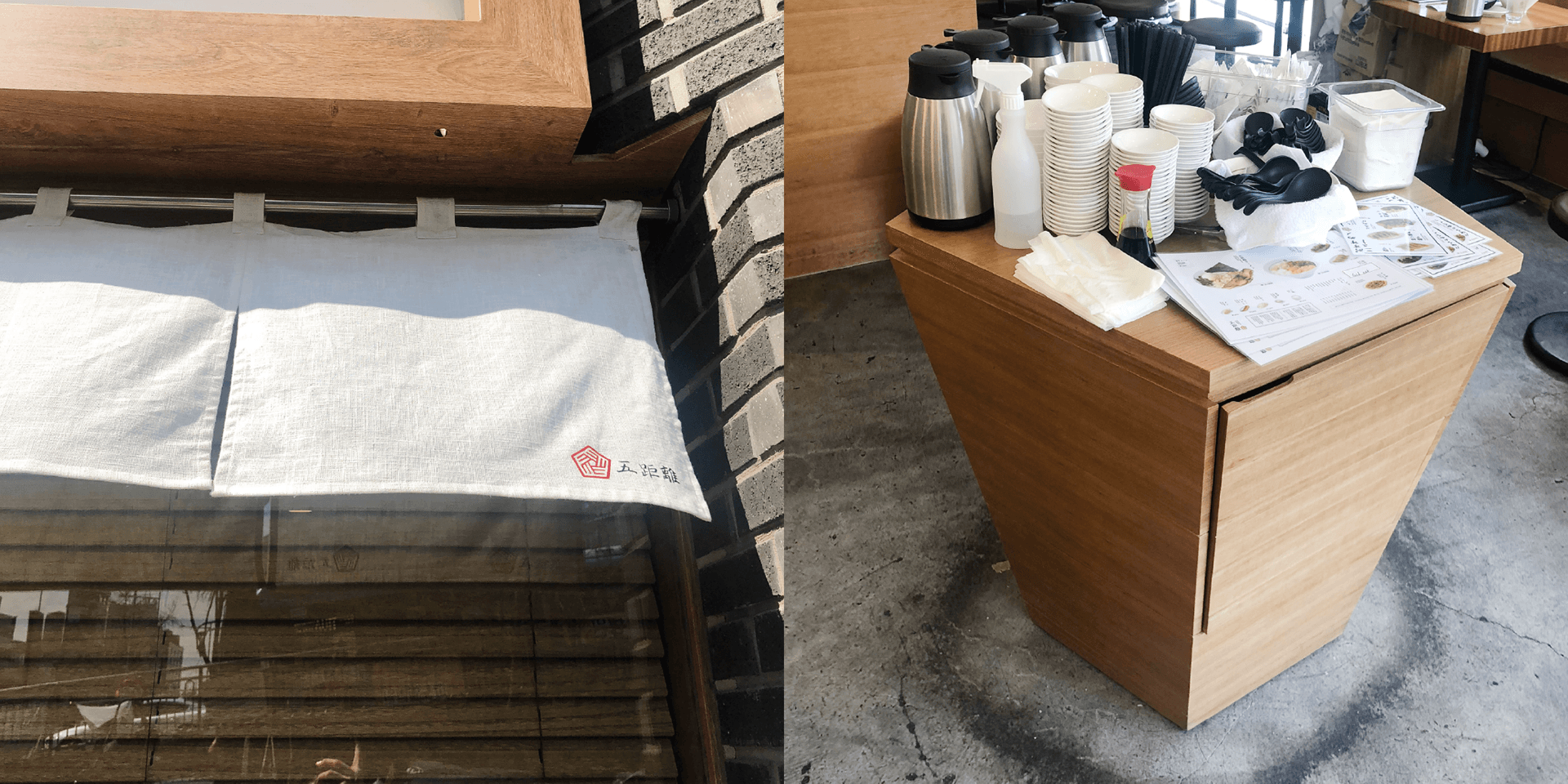
고쿄리는 '오거리'를 의미하는 이름으로, 한남동 오거리에 위치한 라멘 전문점입니다. 브랜드 심벌은 오거리를 상징하는 오각형과 라멘 면발의 형태에서 영감을 받아 디자인했으며, 캘리그래피를 활용한 워드마크를 통해 정성스럽게 우려낸 진한 육수의 깊은 맛과 장인정신을 표현했습니다. 개발된 브랜드 아이덴티티는 식기류, 메뉴판, 간판, 현수막 등 다양한 접점에 일관성 있게 적용되어 고쿄리라멘만의 차별화된 브랜드 경험을 제공합니다.
Gokyori, meaning "five-way intersection," is a ramen specialty restaurant located at a five-way junction in Hannam-dong. The brand symbol was designed by combining a pentagonal shape representing the intersection with graphic elements inspired by the form of ramen noodles. A custom calligraphic wordmark was developed to convey the craftsmanship and rich depth of the restaurant's signature broth. The visual identity was consistently applied across various touchpoints, including tableware, menus, signage, and banners, creating a distinctive and memorable brand experience for Gokyori Ramen.
Client
교코리라멘
Service
로고·브랜드 디자인
Date
2024