젊은한옥 BI 디자인
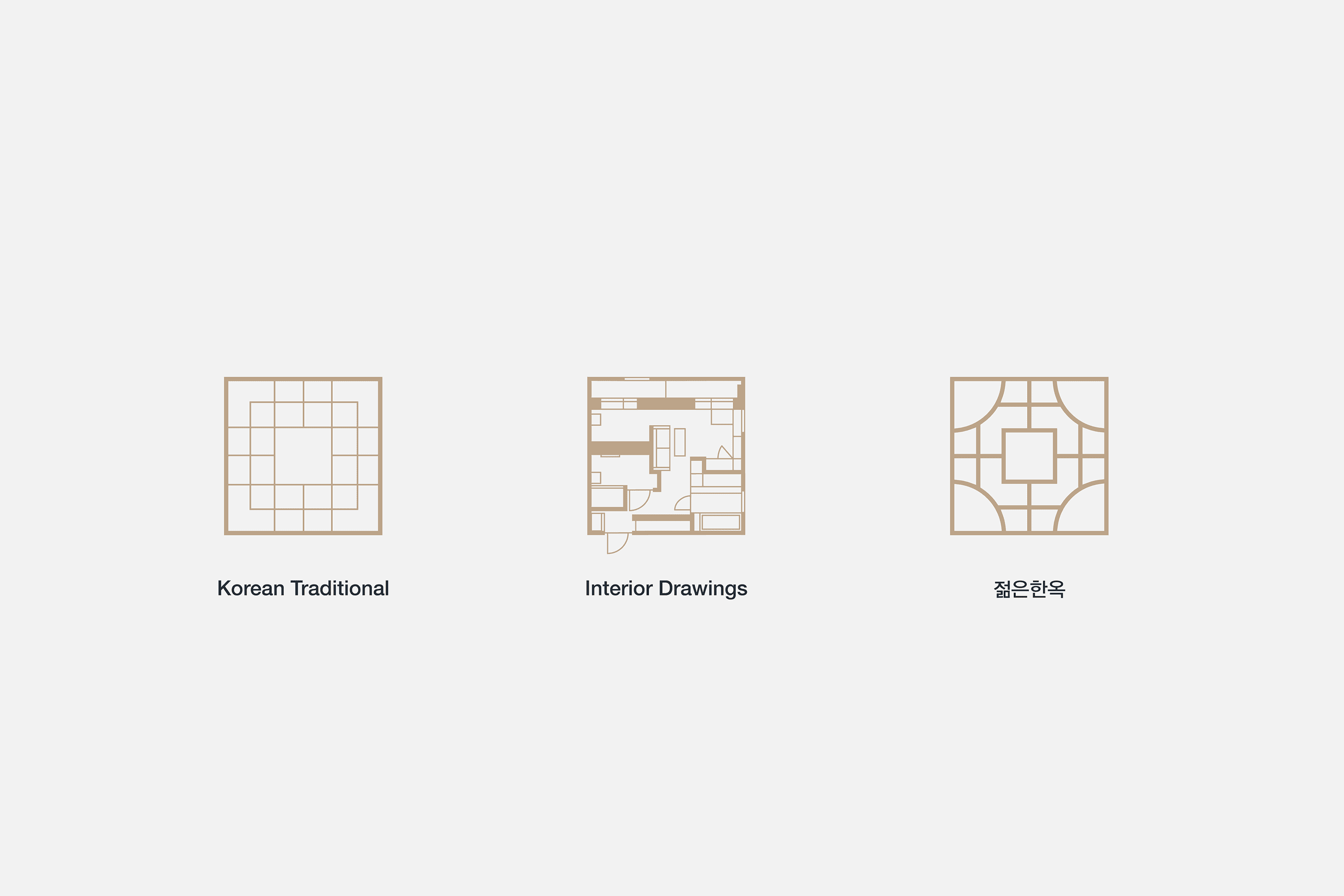
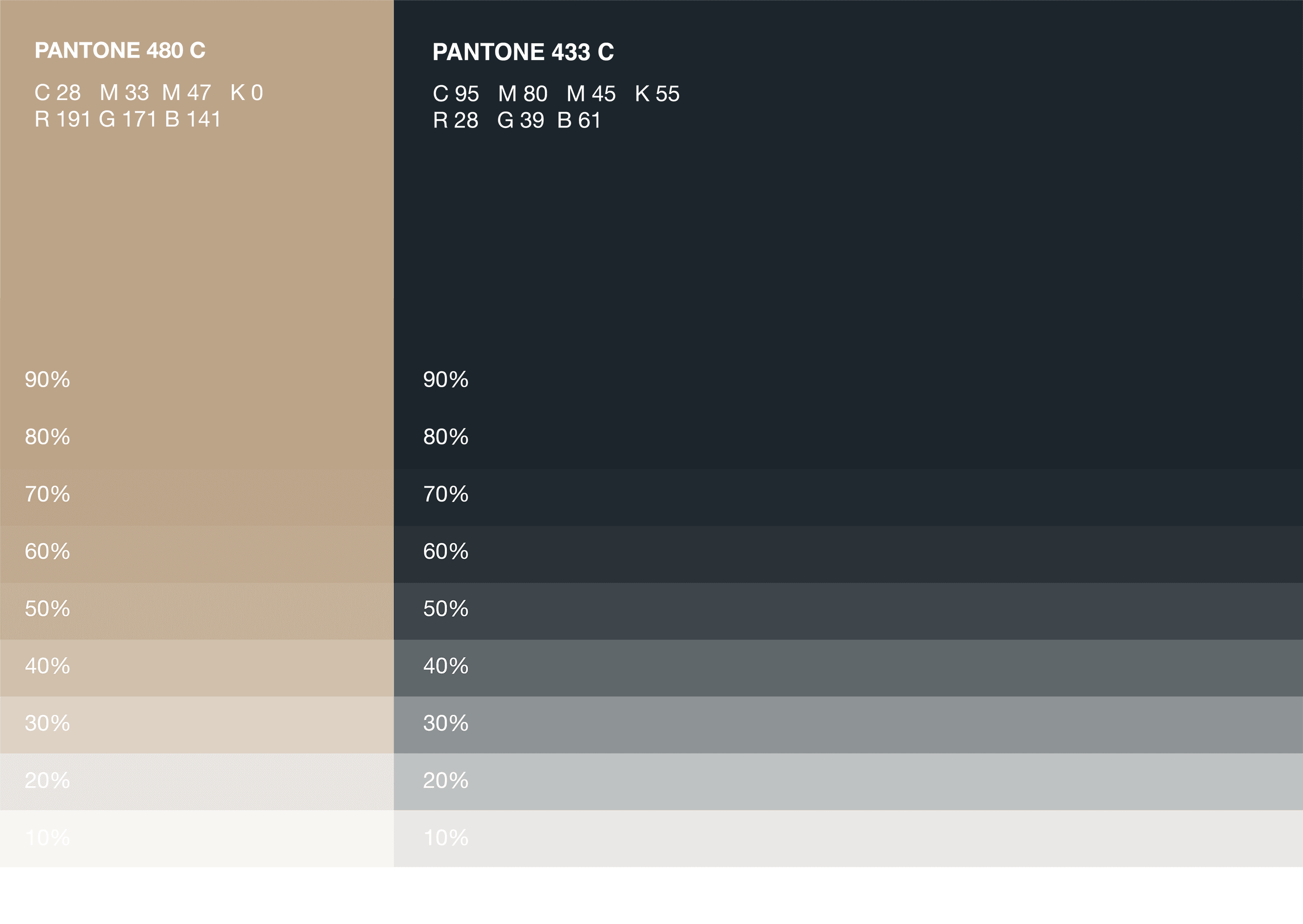
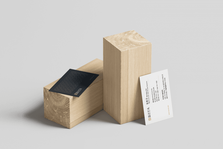
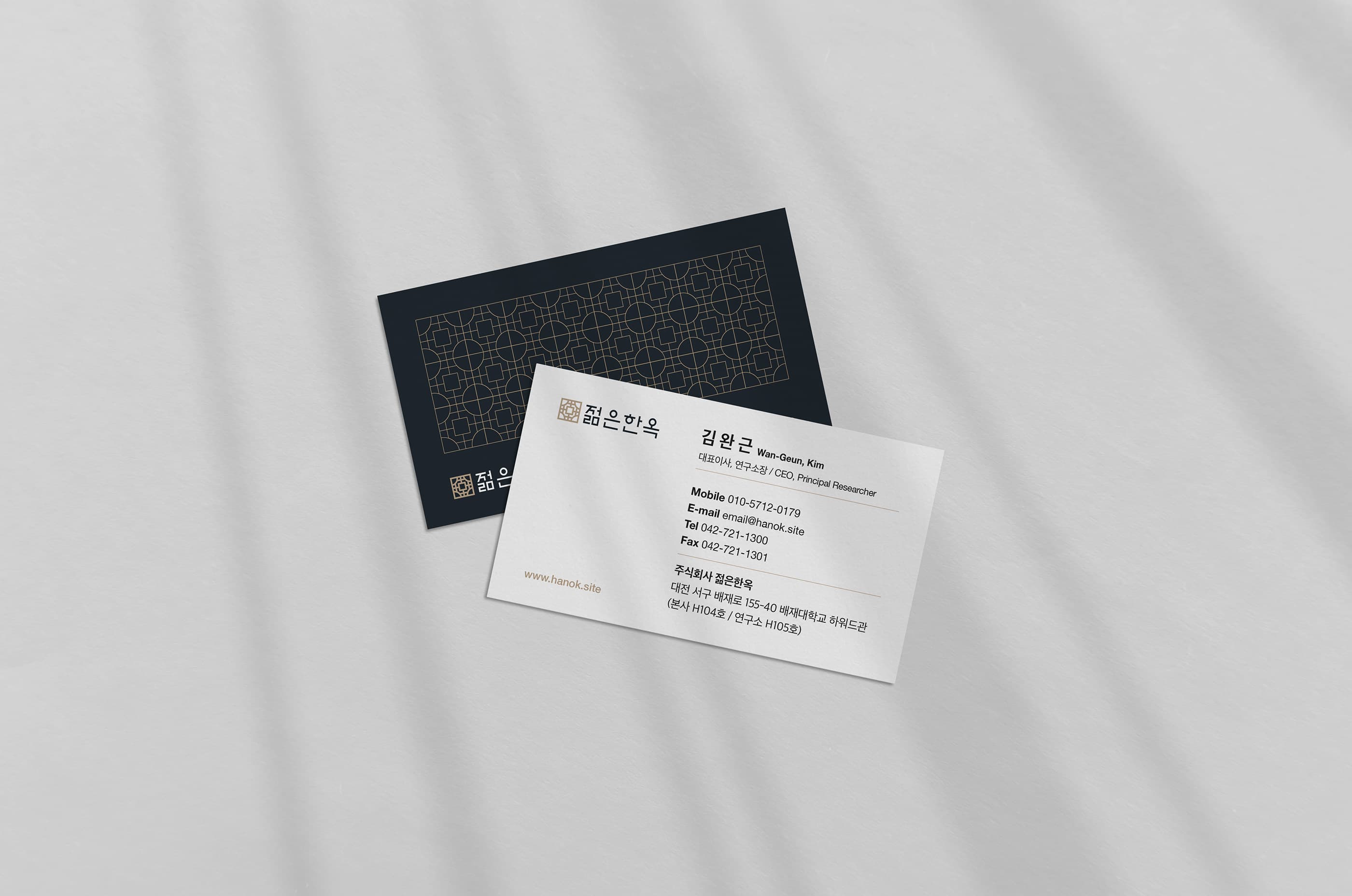
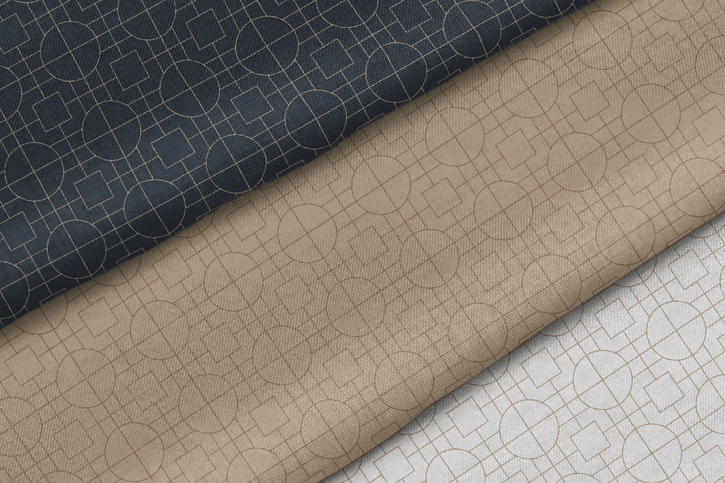
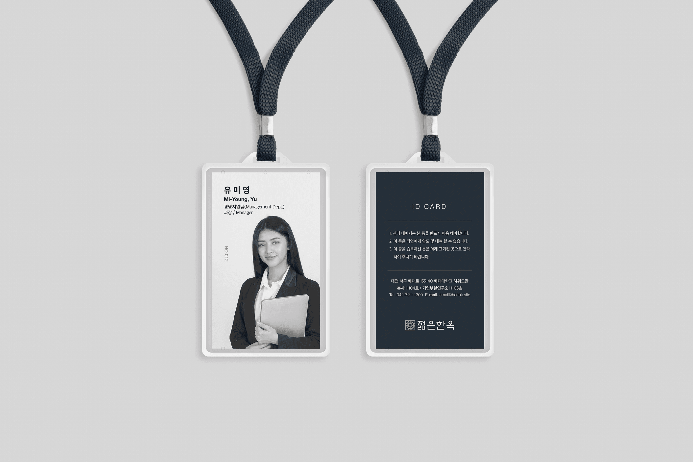
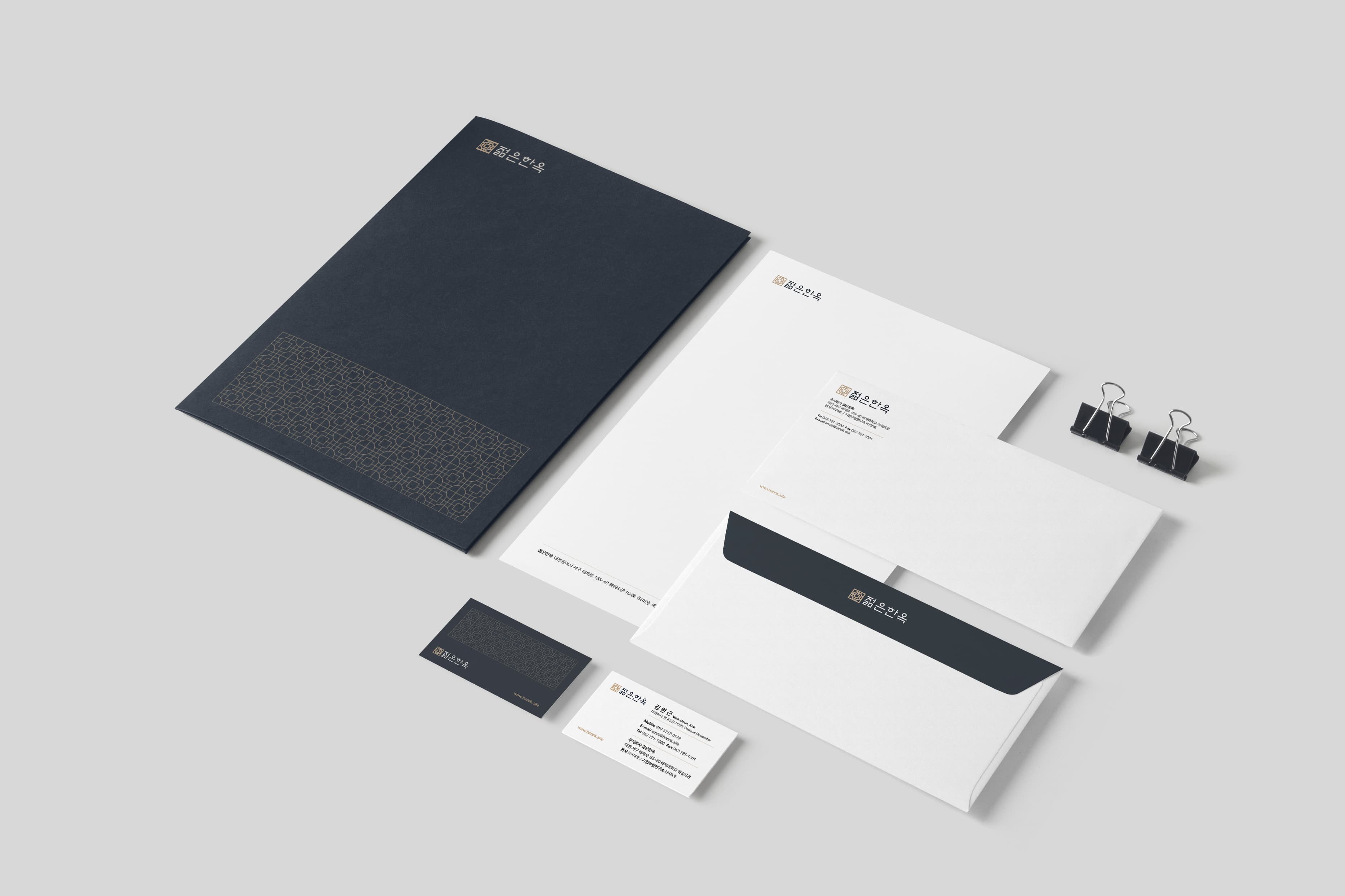
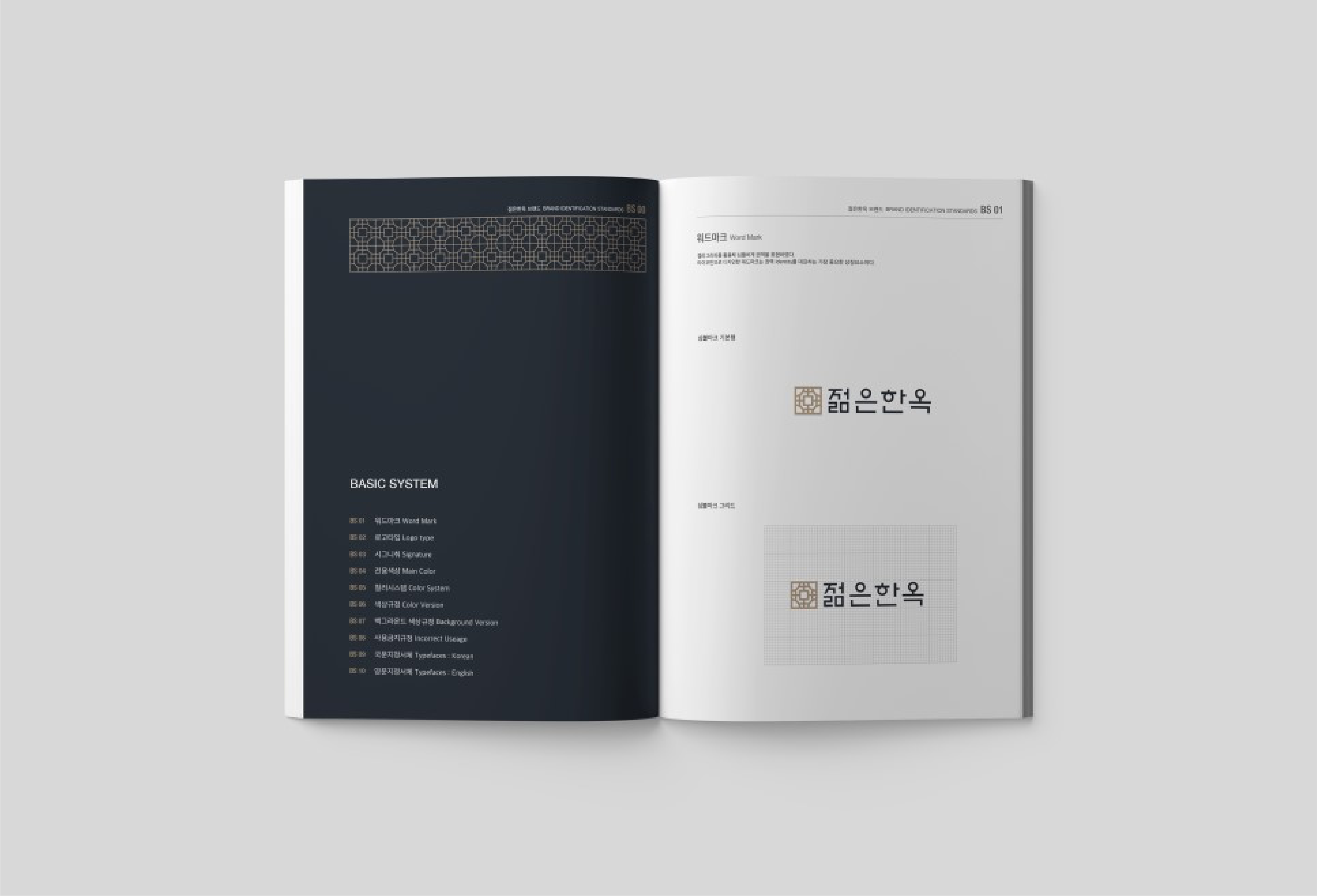
젊은한옥은 전통 한옥의 아름다움을 현대적인 감각으로 재해석한 브랜드입니다. 심벌은 한옥의 이미지를 간접적으로 표현할 수 있는 전통 문양과 건축 도면에서 모티브를 얻어 디자인하였으며, 한국적인 미감과 현대적인 공간의 조화를 담아냈습니다. 워드마크는 훈민정음 해례본의 조형적 요소를 현대적으로 재해석하여 적용했습니다. 또한 기와의 색감에서 착안한 컬러 시스템을 적용하여 젊은한옥만의 고급스럽고 깔끔한 브랜드 아이덴티티를 완성했습니다.
Young Hanok is a brand that reinterprets the beauty of traditional Korean architecture through a contemporary perspective. The symbol was inspired by traditional Korean patterns and architectural floor plans, balancing cultural heritage with modern design. The wordmark incorporates visual elements derived from the Hunminjeongeum Haerye manuscript. The color palette was inspired by the tones of traditional Korean roof tiles, conveying elegance, clarity, and timeless beauty.
Client
(주)젊은한옥
Service
로고·브랜드 디자인
Date
2023