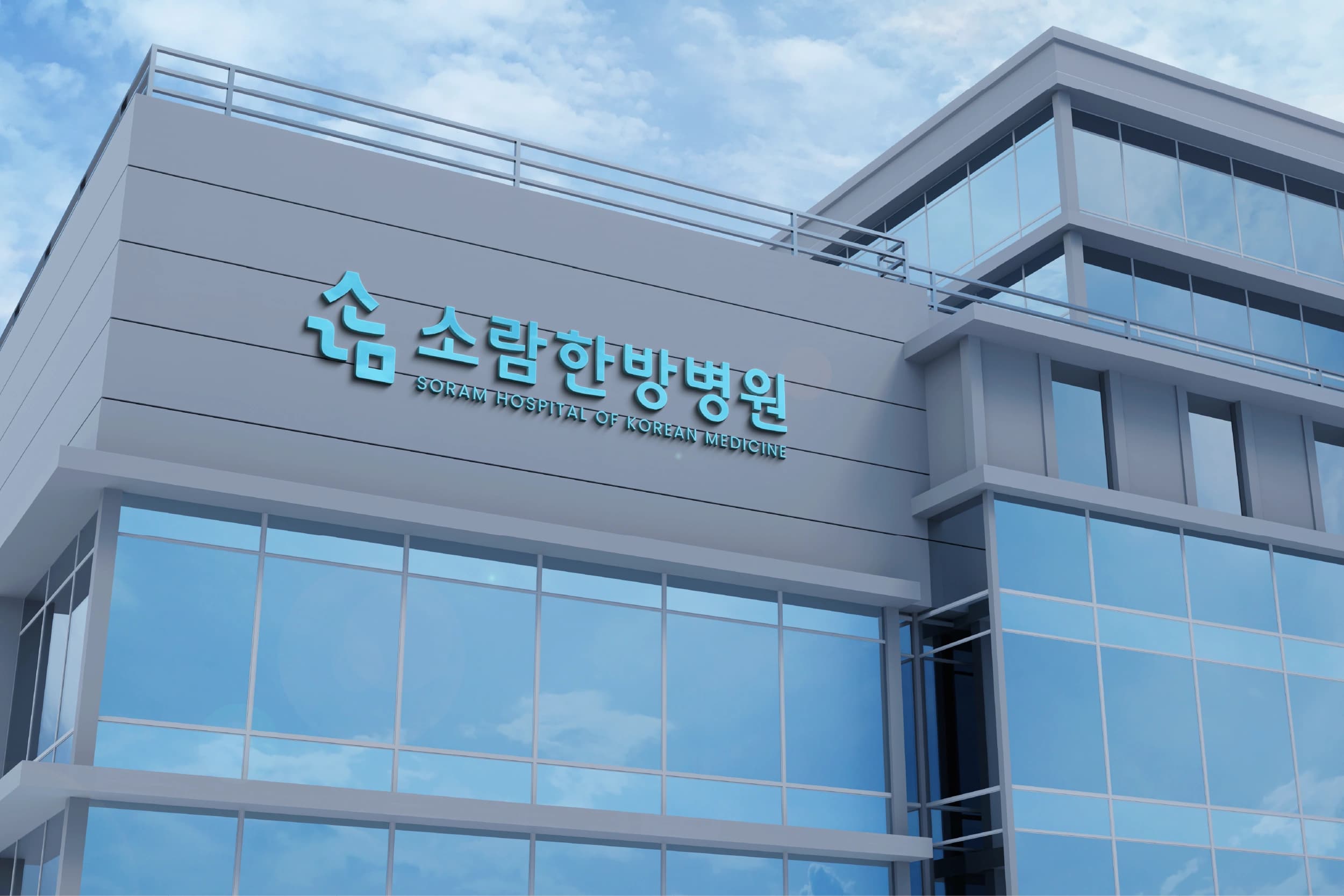
소람한방병원 HI 디자인
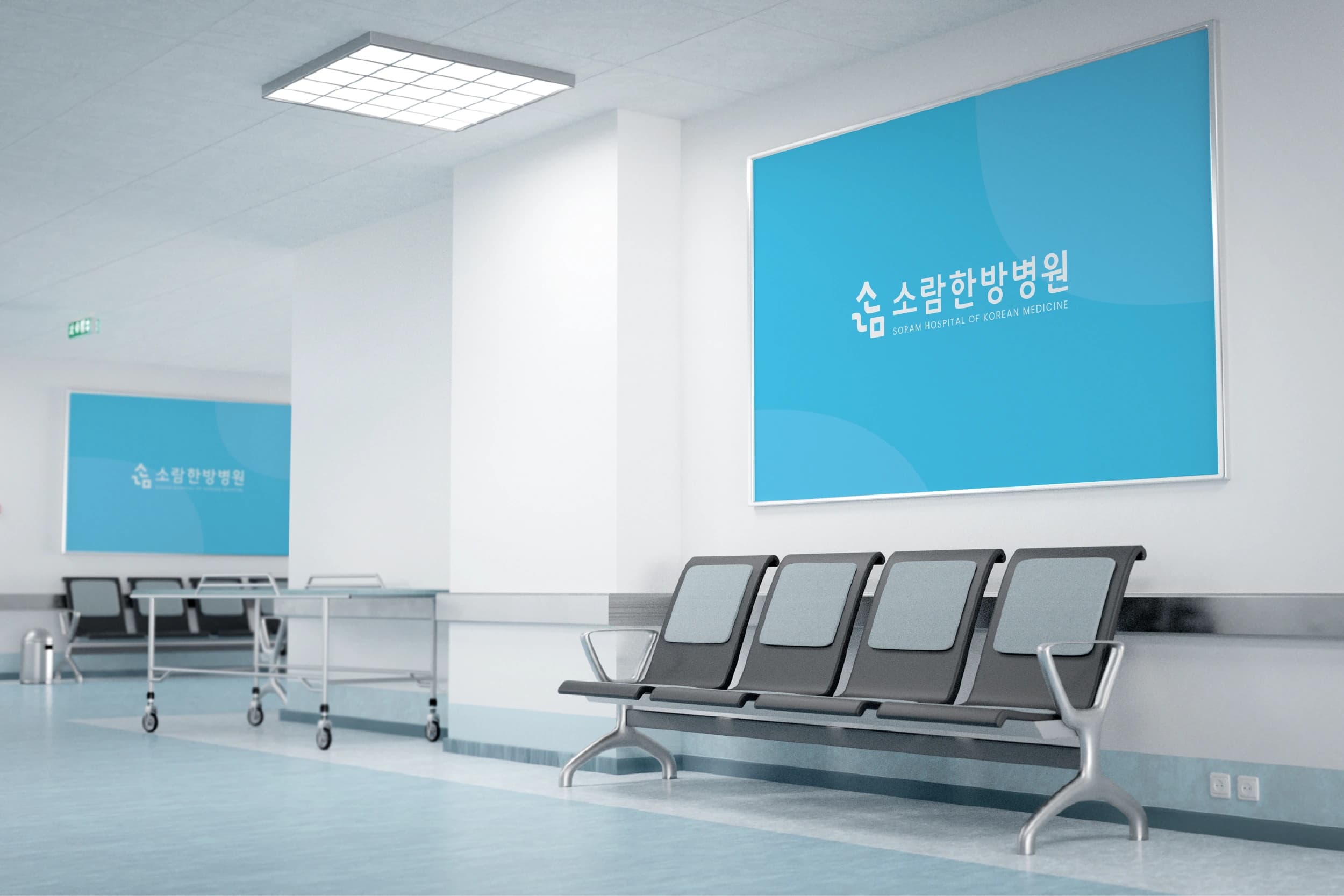
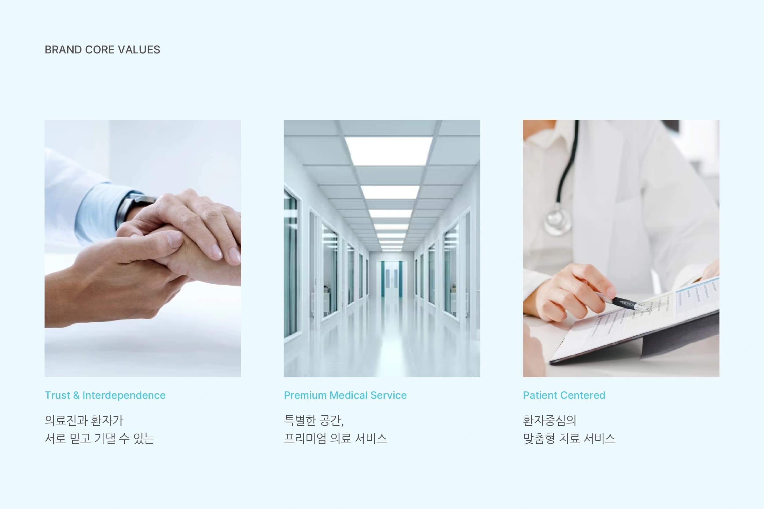
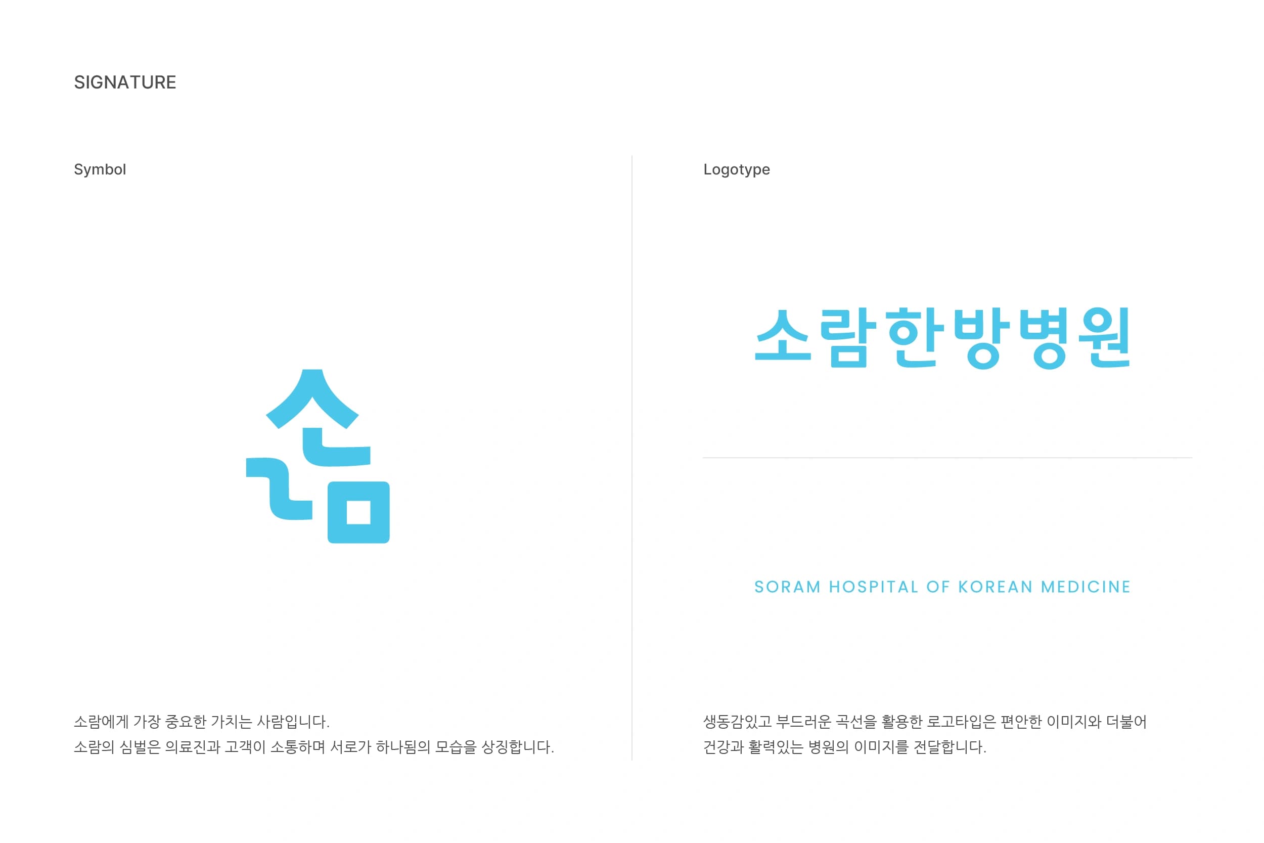
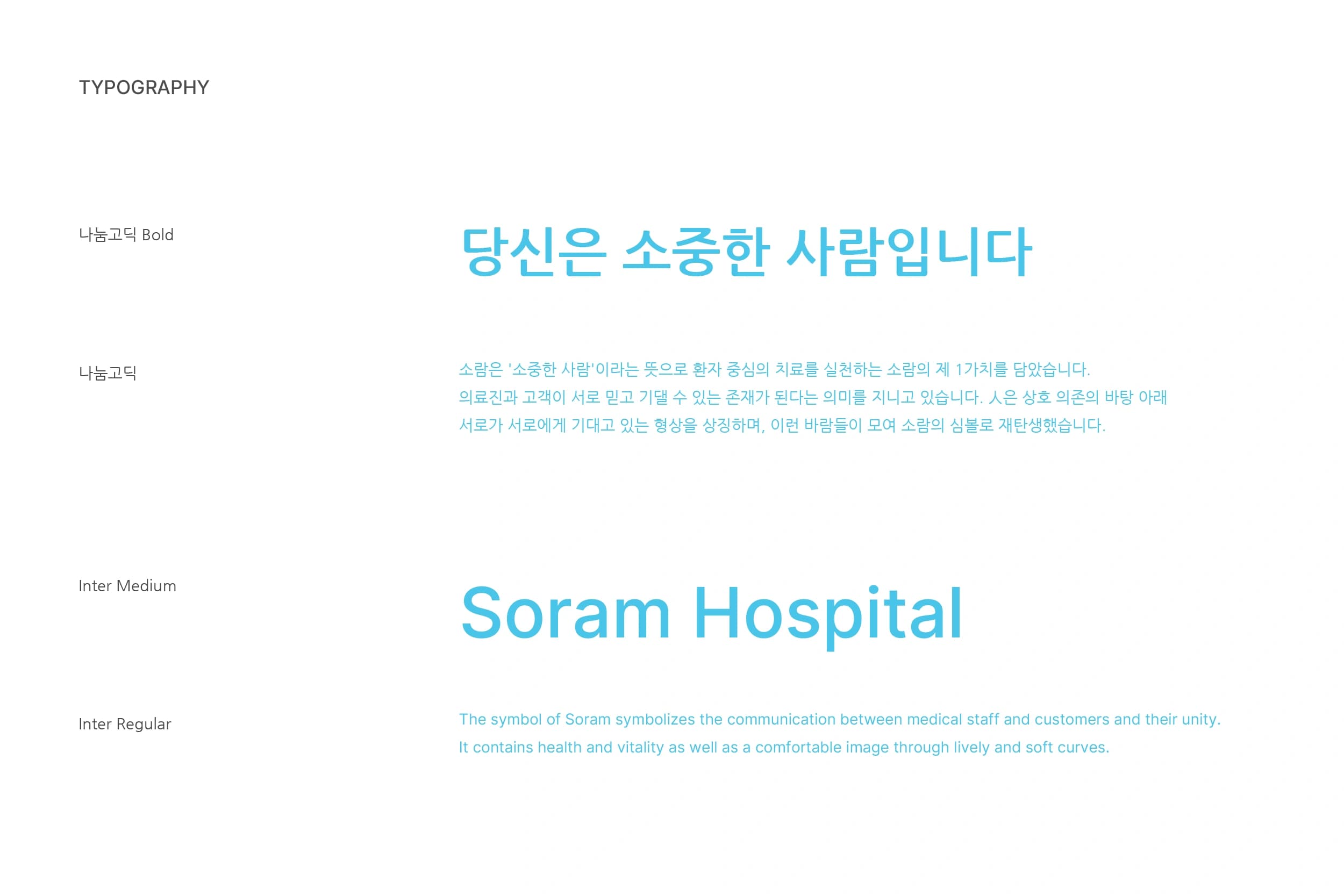
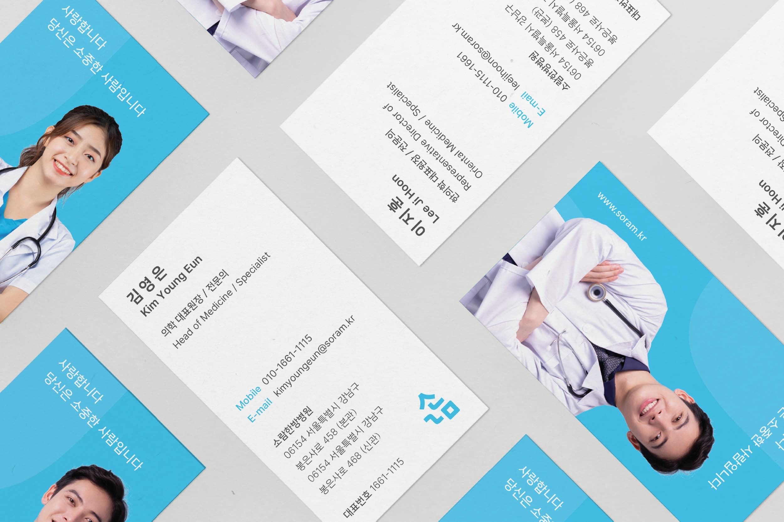
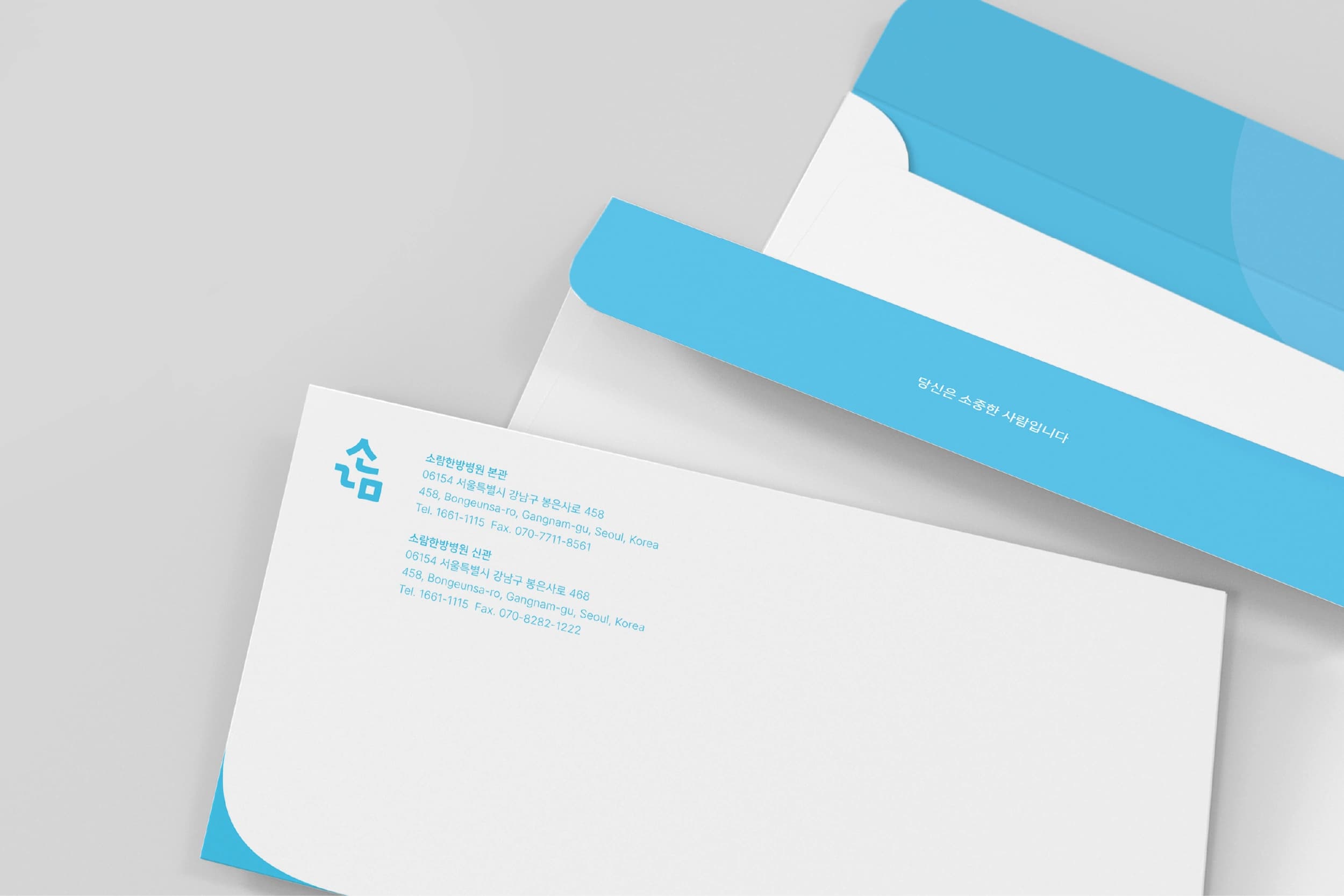
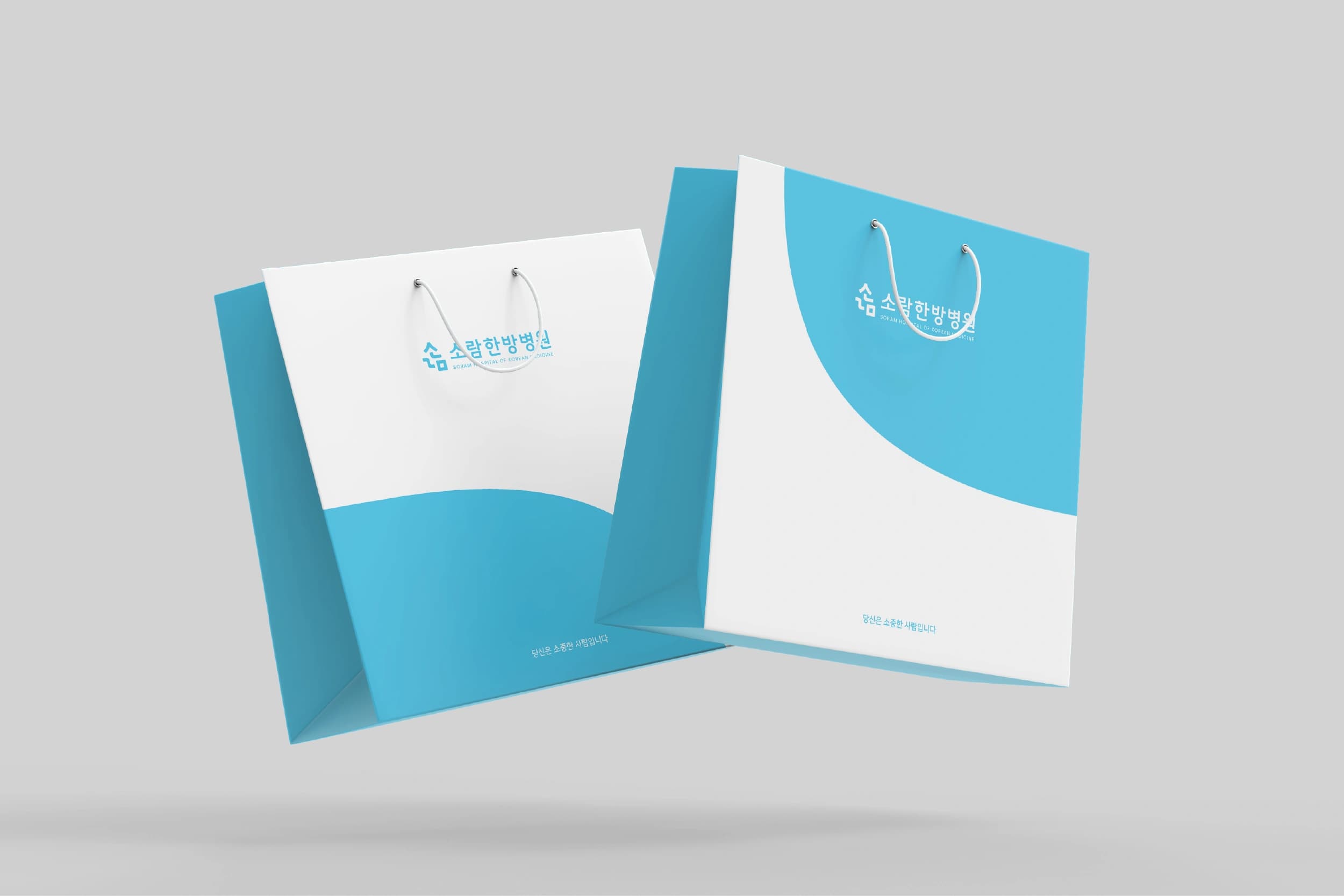
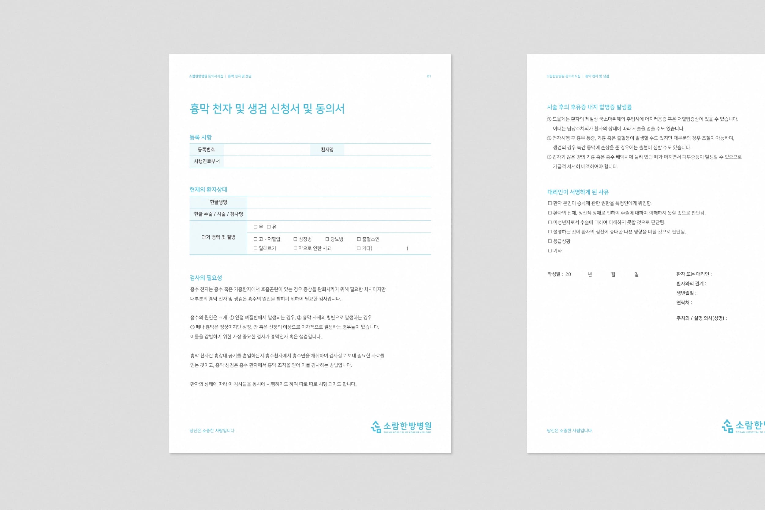
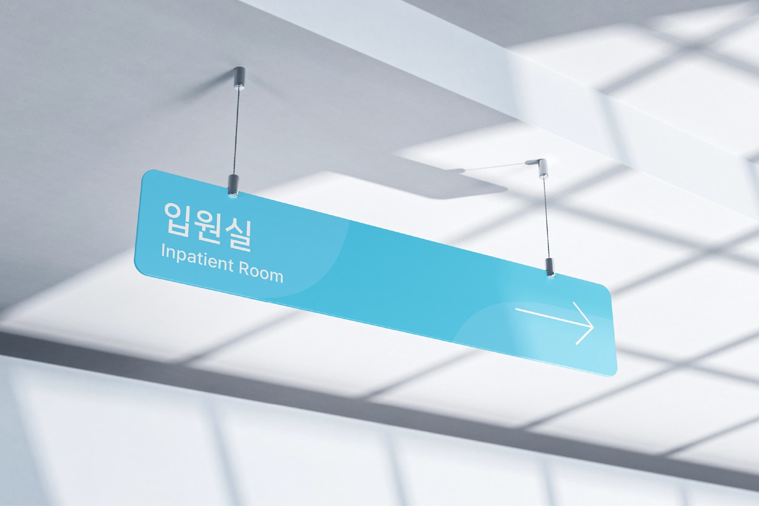
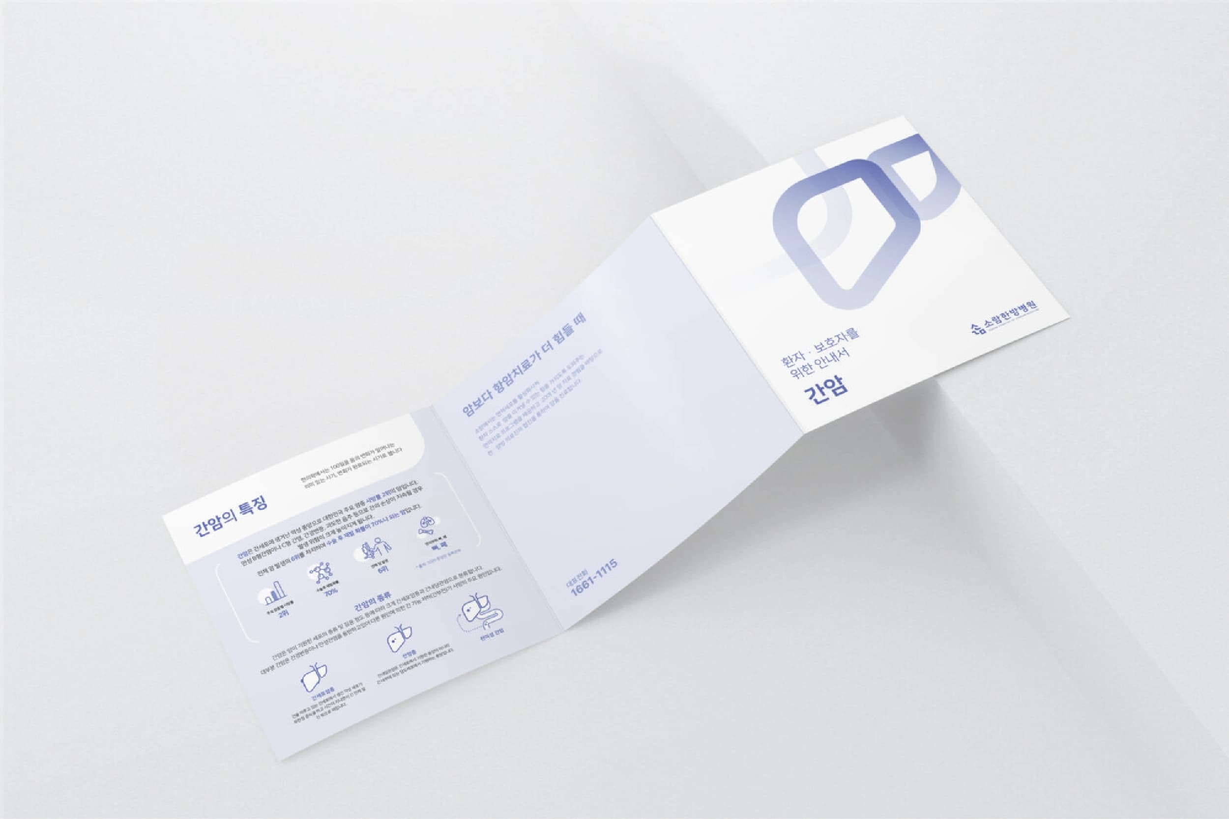
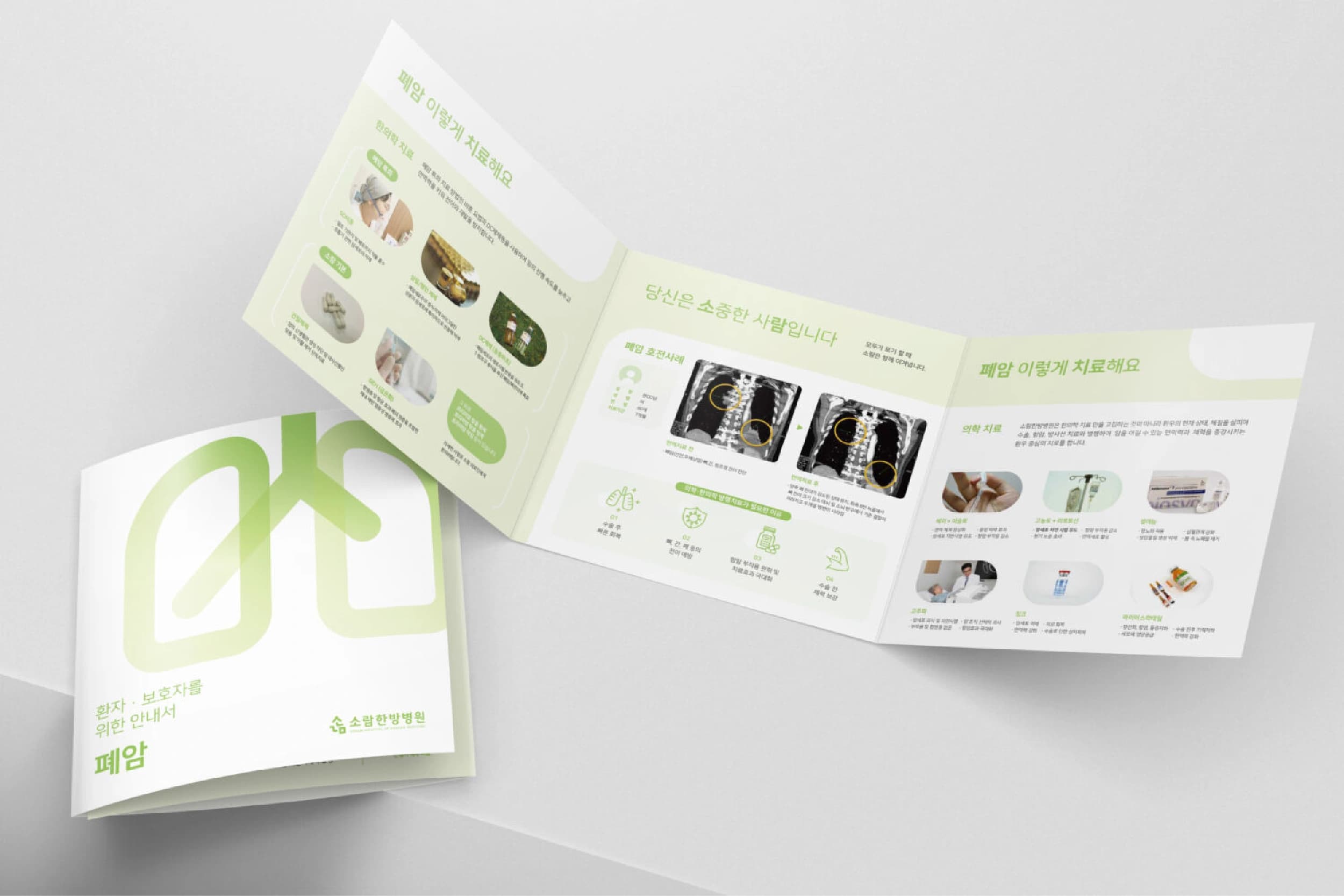
소람한방병원은 환자 중심의 치료 철학을 바탕으로 신뢰와 돌봄의 가치를 실천하는 의료기관입니다. '소람'은 '소중한 사람'이라는 의미를 담고 있으며, 의료진과 환자가 서로 믿고 의지할 수 있는 관계를 브랜드의 핵심 가치로 정의했습니다. 이를 바탕으로 병원의 철학과 정체성을 시각적으로 전달할 수 있는 브랜드 아이덴티티를 개발했습니다. 심볼은 사람 인(人)자의 형태를 모티프로 하여 서로가 서로에게 기대고 있는 모습을 표현했습니다. 이는 상호 신뢰와 연결, 그리고 환자 중심의 의료 서비스를 상징합니다. 브랜드 아이덴티티를 중심으로 로고, 컬러 시스템, 사인물, 인쇄물 등 다양한 접점에 일관된 경험을 구축하여 따뜻하면서도 전문적인 병원 이미지를 완성했습니다.
Soram Korean Medicine Hospital is a healthcare brand built around patient-centered care, trust, and compassion. The name Soram means "precious person," reflecting the hospital's commitment to creating meaningful relationships between medical professionals and patients. Based on this philosophy, a comprehensive brand identity was developed to communicate the hospital's values with clarity and consistency. The symbol is inspired by the shape of the character 人 (person), representing people leaning on and supporting one another. It embodies trust, connection, and a human-centered approach to healthcare. The identity system was extended across logos, color palettes, signage, printed materials, and various brand touchpoints, creating a warm yet professional healthcare experience.
Client
소람한방병원 / 씨엔에이치코퍼레이션
Service
로고·브랜드 디자인 / 사이니지 디자인 / 편집 디자인
Date
2024