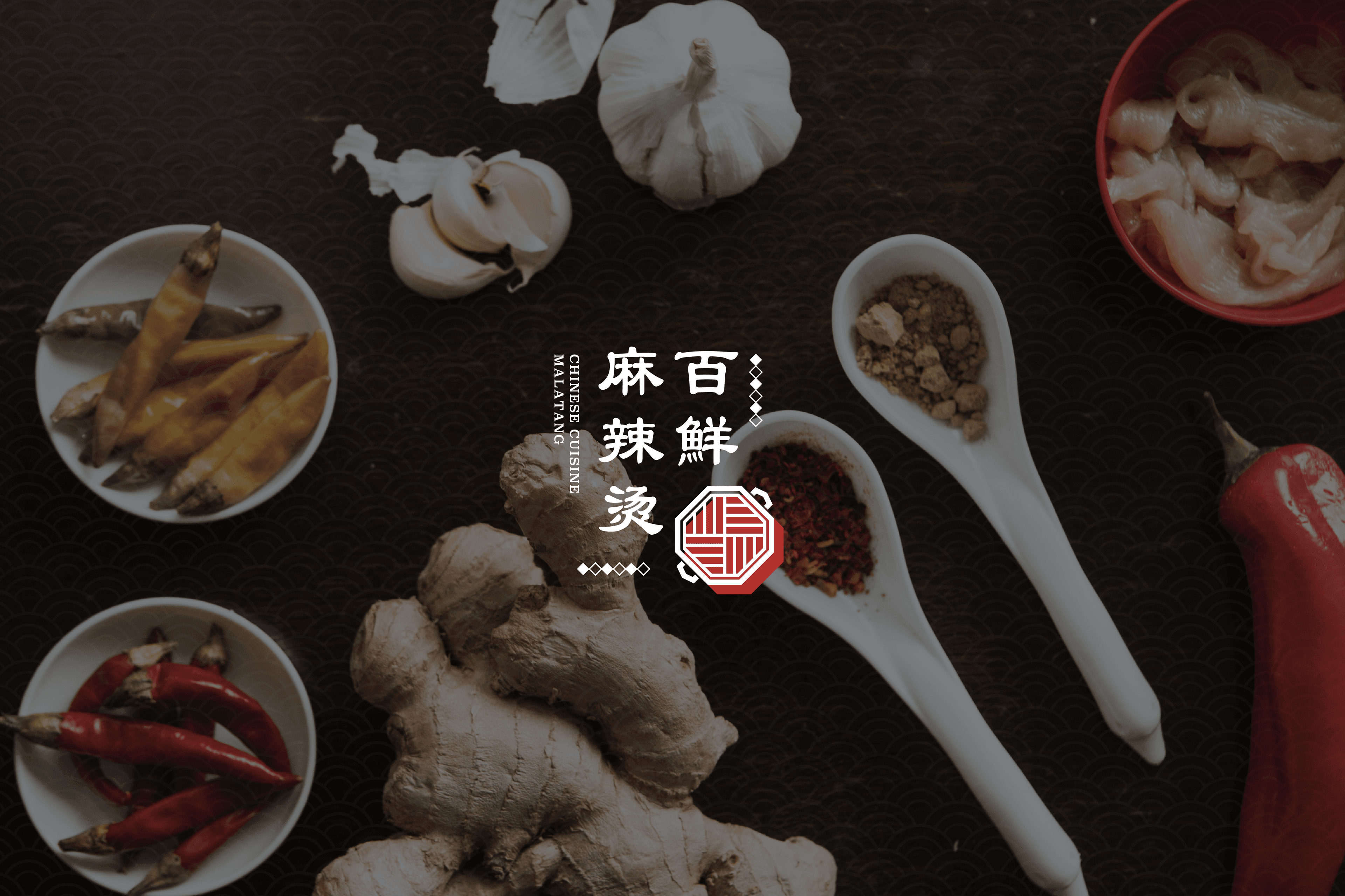
백선마라탕 BI 디자인
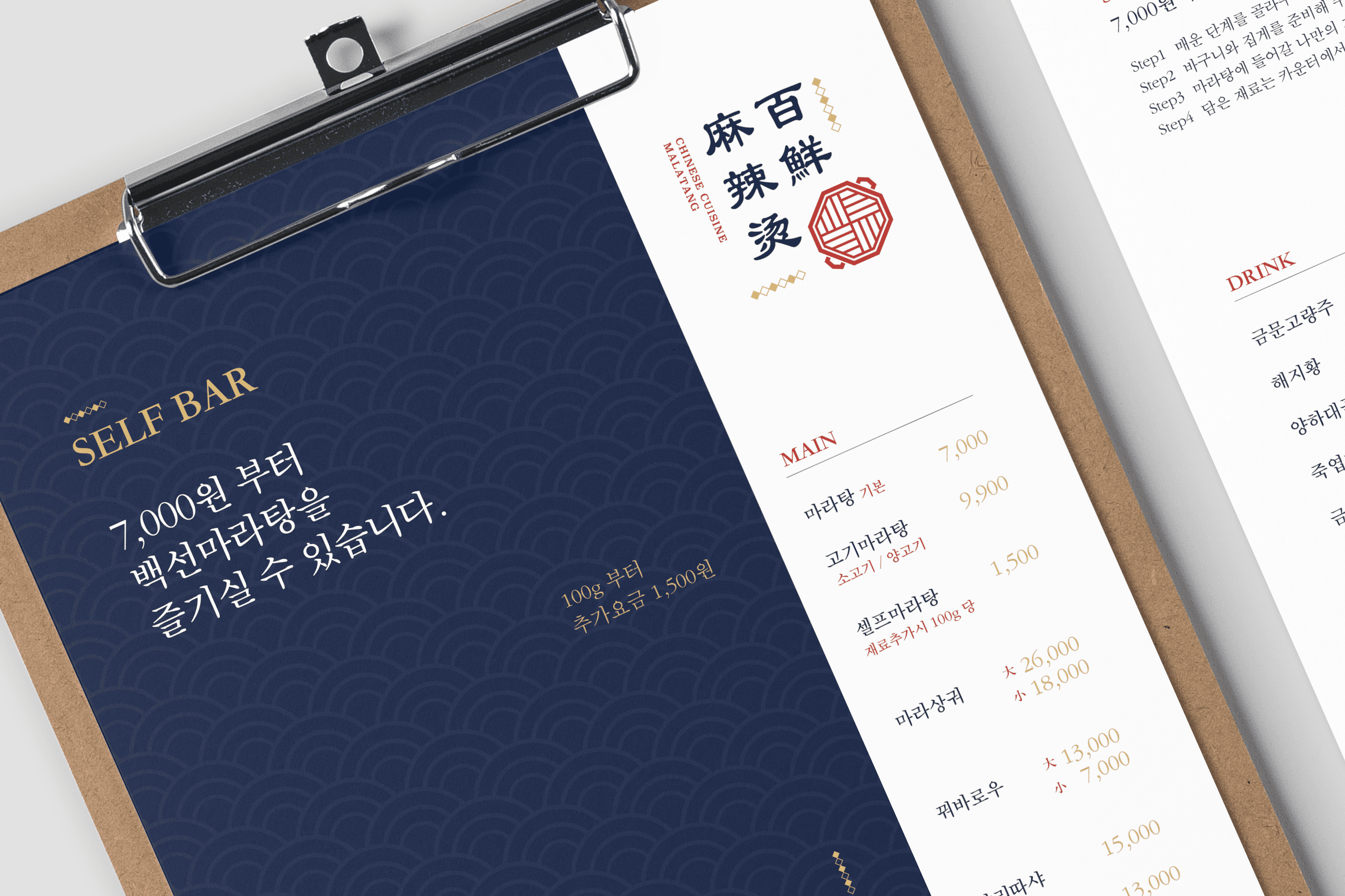
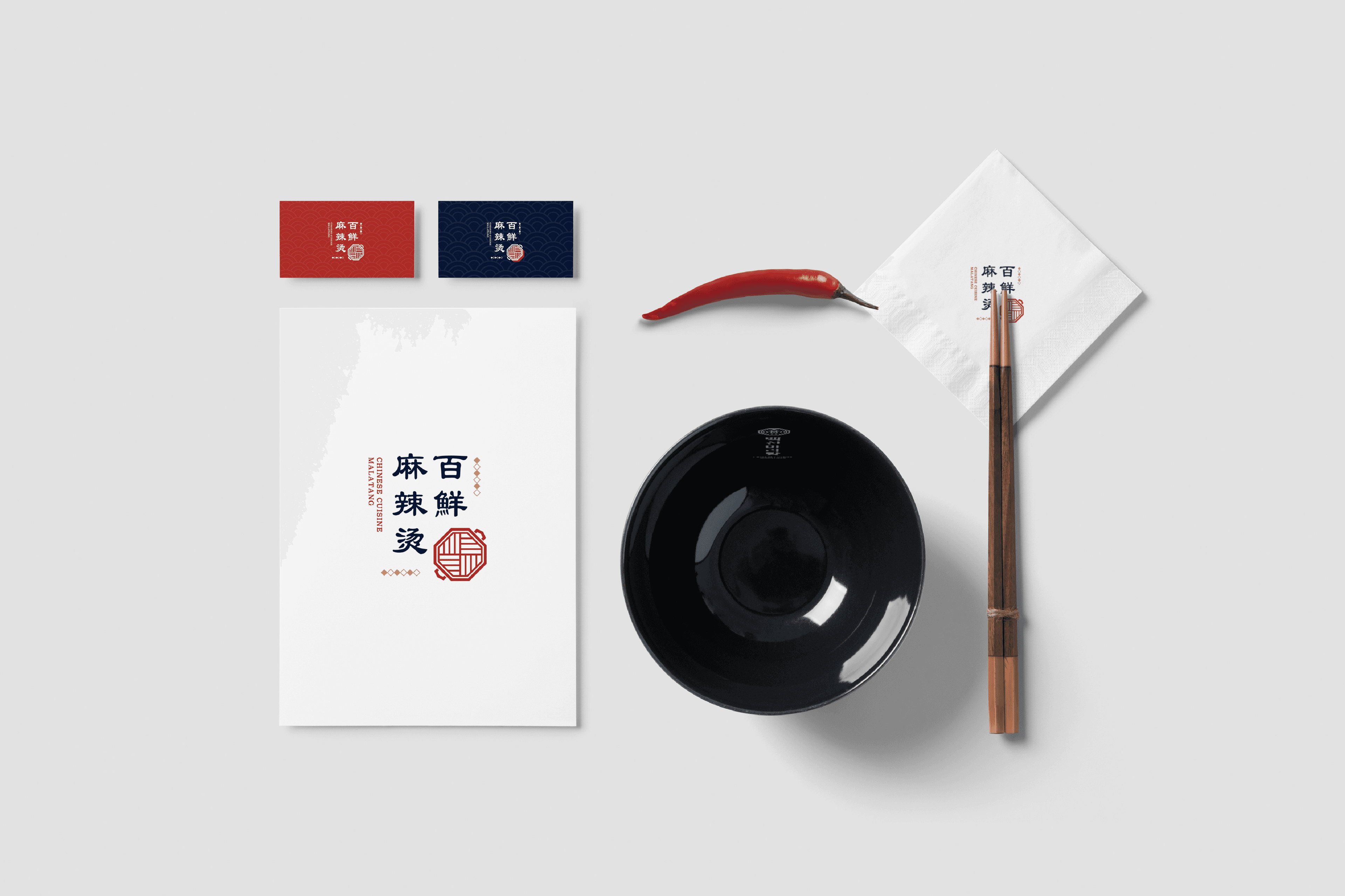
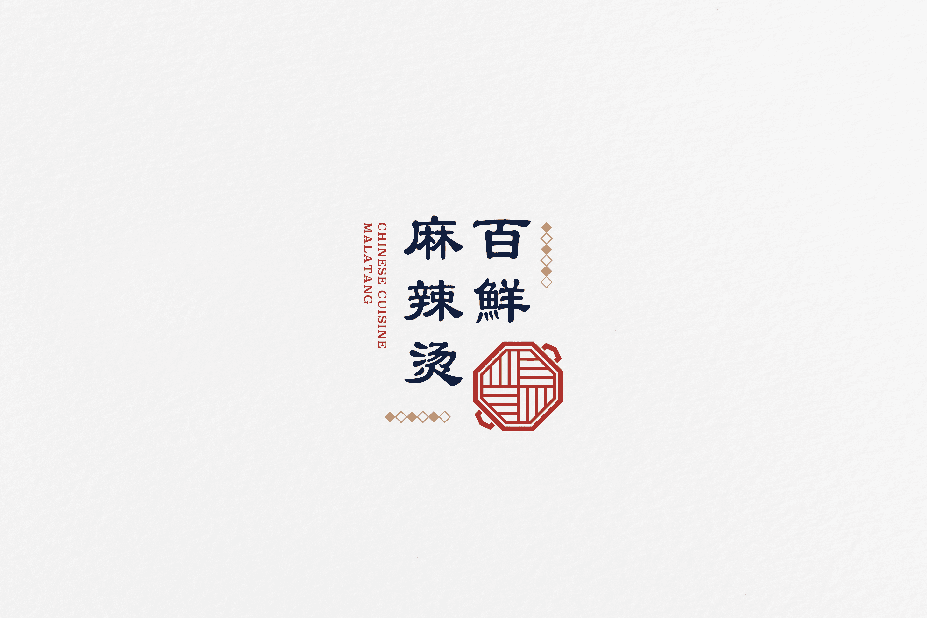
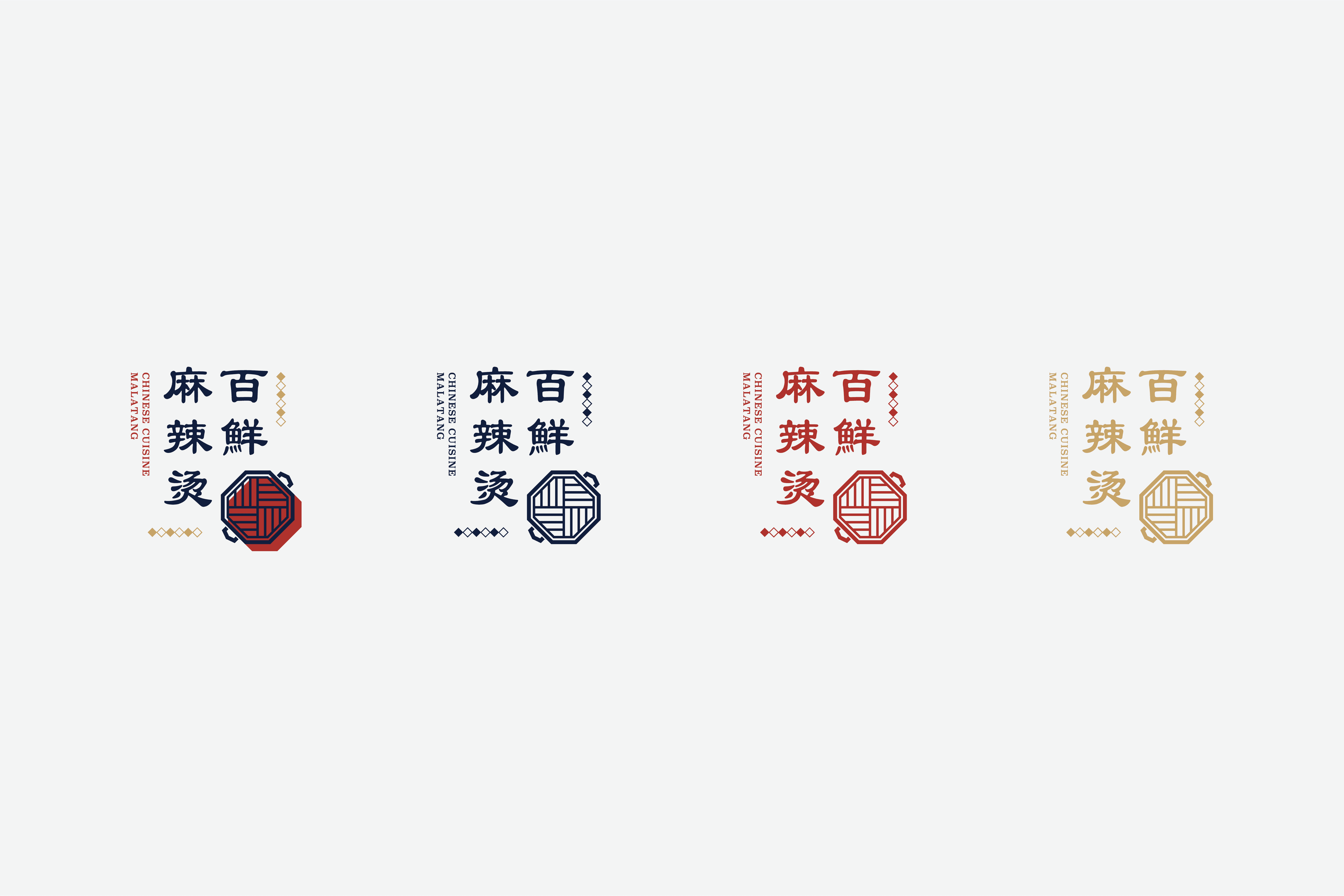
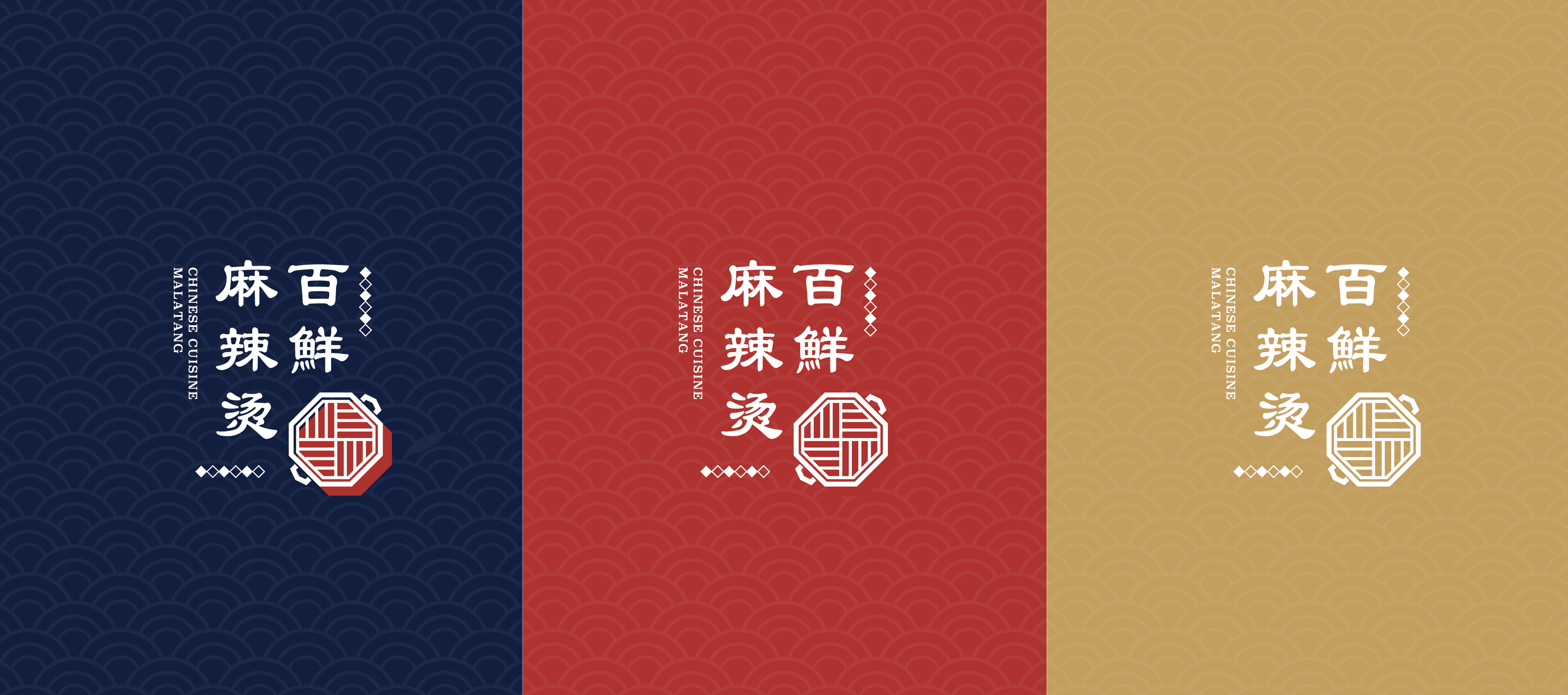
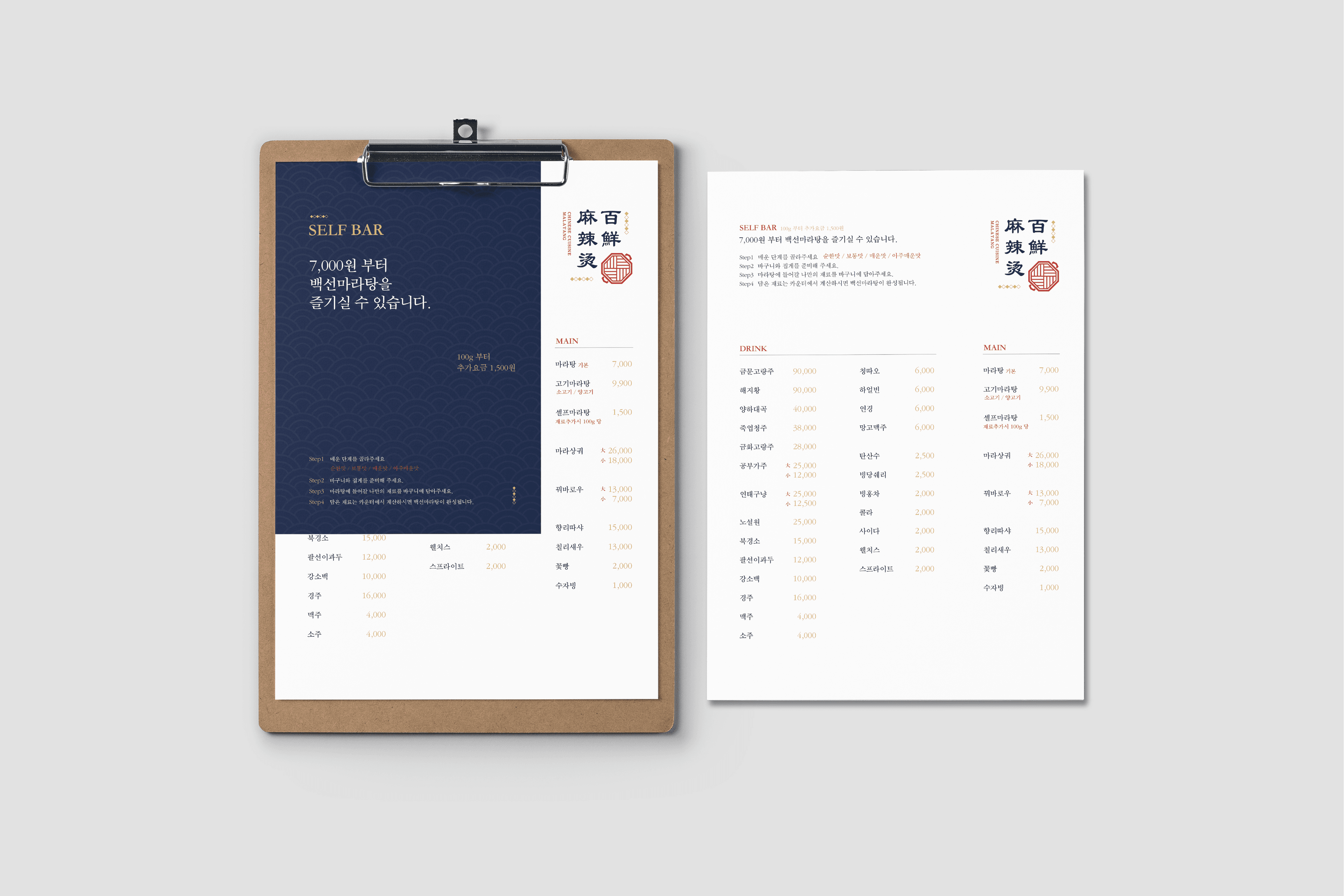
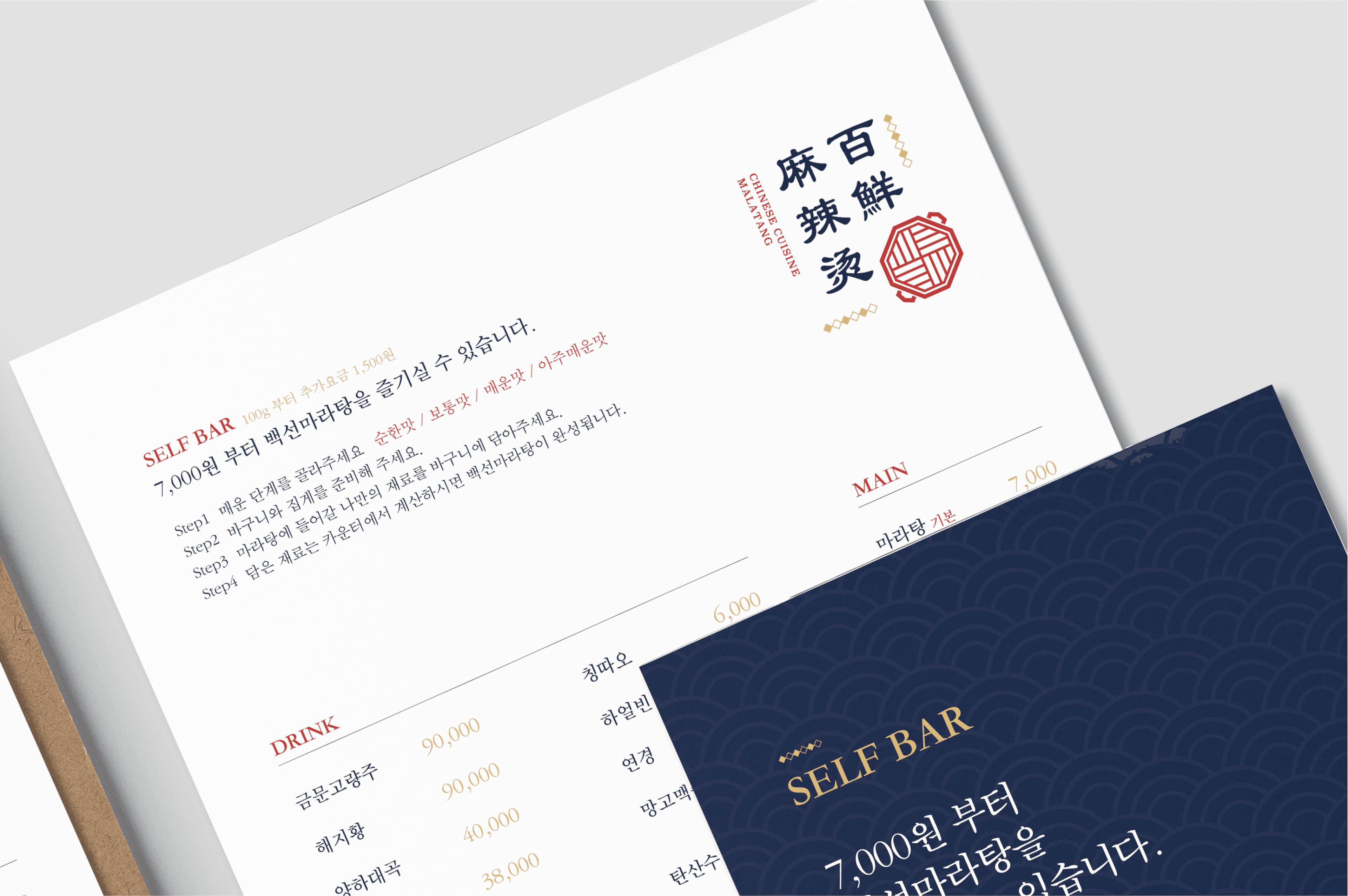
백선마라탕은 다양한 재료를 취향에 맞게 선택하여 즐기는 마라탕의 특성을 브랜드 아이덴티티에 담아냈습니다. 심벌은 여러 신선한 식재료가 하나의 그릇 안에서 조화를 이루는 마라탕의 이미지를 모티브로 개발하였으며, 풍성함과 다양성을 직관적으로 표현했습니다. 개발된 아이덴티티는 식기류, 메뉴판 등 다양한 브랜드 접점에 일관성 있게 적용되어 백선마라탕만의 차별화된 이미지를 구축합니다.
Baekseon Malatang's brand identity reflects the essence of malatang, a dish enjoyed by combining a variety of ingredients according to individual tastes. The symbol was developed from the image of fresh ingredients coming together in a single bowl, visually expressing the richness, diversity, and harmony that define the dish. The identity system was applied consistently across various brand touchpoints, including tableware and menus, establishing a distinctive and recognizable brand image for Baekseon Malatang.
Client
백선마라탕
Service
로고·브랜드 디자인
Date
2023